Author: admin

AI’s inspirational spark

Lighting the path of inspiration

The integration of AI into marketing strategies has sparked a surge of creative inspiration. Tons of cool ideas are popping up, changing how we do marketing in the digital world. Now, AI is deciding the next flavour of your soda and the new label of your favourite product. Continue reading to discover some of today’s most unique AI marketing campaigns.

The excitement of tomorrow

AI is just as exciting and interesting to companies as it is to consumers. There is a joint enthusiasm about creating a buzz around these brands who use AI to come up with cool new marketing material. People are excited to see how AI can change their daily lives, eagerly anticipating the next wave of innovation that AI will bring.

Credits: Coca-cola and Ads of the world

Coca-Cola took people’s vision of the future and crafted an AI-generated flavour. Intrigued, we sampled it at the office, revealing a genuinely futuristic taste.

Credits: Ads of the world

The latest trend involves feeding AI prompts that it generates into images. Heinz took this trend to the next level, providing AI with a single prompt: ”ketchup.” To their astonishment, every bottle produced exhibited a striking resemblance to the iconic Heinz bottle.

Credits: LinkedIn, Dezeen, and BMW

We are all eagerly looking forward to exploring the future possibilities and contributions that AI may offer. What are your thoughts on what AI might bring next?

Credits: Hyundai and Resumé (Sweden rock festival)

Captivating stories for great impact

Share customer success! Captivating B2B case studies are powerful marketing tools. Together with Alfa Laval we created several compelling case studies highlighting different products, services, industries, and applications. With a focus on sustainability and cleantech we use different approaches to feature specific aspects of the story. Based on research, interviews, and technical information, we create interesting key messaging, copy, layout, visuals, and infographics. The results are captivating case stories highlighting Alfa Laval’s capabilities, building credibility and trust. Most importantly, they act as an inspiration for innovative investments for a more efficient and sustainable future.

As it turns out, not only innovative companies are interested in Alfa Laval’s sustainable work. French President Emmanuel Macron and His Majesty King Carl XVI Gustaf are visiting the site in Lund today with a focus on the transition to more sustainable energy.

Read more here

Hello, 2024!

In a changing world, branding is critical! Focus on the brand essence, strong and vital concepts, and 360-degree energetic campaigns.
Get in a good mood for marketing!


The essence of building a brand

As a full-service agency, we take a holistic approach to marketing – from strategy, concept and communication throughout the value chain. We adapt to your needs so that you can continue to do what you do best.
Adentity Communication Platform™ is a proven 3 step roadmap to secure long-term branding success.

STRATEGY
Adentity identifies your key market segments, defines a brand strategy and builds a strong position based on your mission,
core values and offer.

CONCEPT
Adentity develops creative concepts that follow a defined strategy to create consistent value-based communication.

CONCEPT-GUIDED CAMPAIGN
We implement concept-guided campaigns through the most effective channels to connect with your target groups.

Welcome to Adentity! Want to share thoughts?  Contact us here

A day of Danish delights and artistic discoveries

En dejlig dag for the Adentity team kick-off

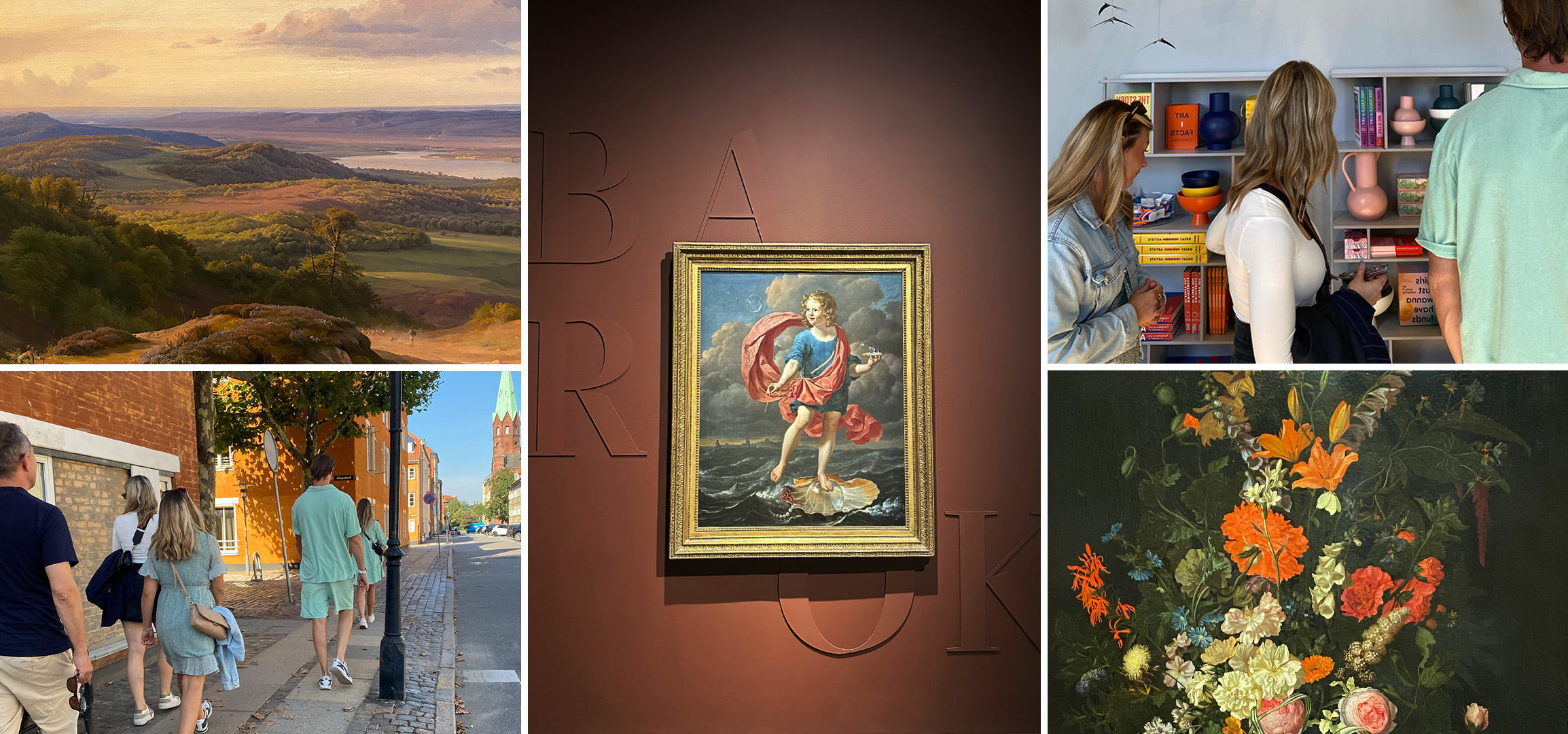
The Adentity team embarked on a kick-off journey to Copenhagen, and we knew we were in for a treat when the beaming sun rose for a late summer visit. The day was filled with culinary delights, artistic inspiration, and the pulse of a vibrant city. Our agenda was simple yet indulgent: savouring the finest Danish cuisine, exploring the captivating world of art at a renowned museum, and keeping a watchful eye on the latest trends that Copenhagen had to offer.

Morning glory in Copenhagen

A good Danish pastry for breakfast at Torvehallerne in the heart of Copenhagen set the right tone for the rest of our day. On our way to the museum, we walked through the beautiful Botanical Garden. There is a large lake in the middle of the garden, where we stopped and took some photos of the magnificent palm house, which reflected beautifully on the lake.

Baroque – Out of Darkness

For the first time in over 100 years, the National Gallery of Denmark has retrieved and restored some of the Baroque’s most distinguished art pieces. In the art world, the term ¨Baroque¨ has sometimes been used disrespectfully, but our visit to the SMK to experience the Baroque – ”Out of Darkness” exhibition completely shattered any misconceptions. The collection was a masterpiece, finely orchestrated with accompanying music that heightened the overall sensory experience. The museum displayed an impressive selection level and featured various outstanding Baroque artists.

Craftmanship and hidden gems

While wandering the streets of Copenhagen, we stumbled upon a beautiful store where they hand-crafted their own glass sculptures and other items. To see more of their beautiful pieces, you can visit their website here.

Rundetårn – great views over the city

The last stop of this memorable trip to Copenhagen was completed at the top of Rundetårn, offering a panoramic view of the vibrant city. From this point, we reflected on the day´s experiences, looking forward to upcoming projects and the comforting arrival of autumn.

Thank you for this time, Copenhagen, vi ses!

Future digital trends – Metaverse, VR, AI & 3D elements

Get your head in the game – literally! Digital techniques are continuously evolving and in the near future, you should keep an extra eye on these 4 trends that we believe will be used more in everyday use. Metaverse, virtual reality, artificial intelligence and 3D are terms we get more familiar with as the digital universe evolves. The next step seems to be the buzzing Metaverse, where you might be able to explore a whole new virtual reality – in the comfort of your own home.

What do you think of the idea of a Metaverse? Adentity is in for the journey and although we are unsure if it will become a reality in the near future, we are excited to follow the updates.

Metaverse – A new internet universe

Imagine having a whole new platform and meeting place where the possibilities to market brands are enormous. Imagine moving in-person meetings and zoom meetings to a 3D virtual reality space with personalized avatars – a digital version of yourself! This is what world-leading companies such as Google and Microsoft keep investing in, a new internet universe – Metaverse.

Credits: Yukun Zhou – Metaverse shopping center

In 2023, VR will advance to a new level. With the launching of VR headsets, the accessibility to the Metaverse will increase. VR headsets will open a new door to Metaverse where marketing will have a new impact on brand and customer experience. To mention a few, UX design, brand experience and the way people experience information will adapt to this virtual universe.

AI – a threat to designers or a useful tool for creation?

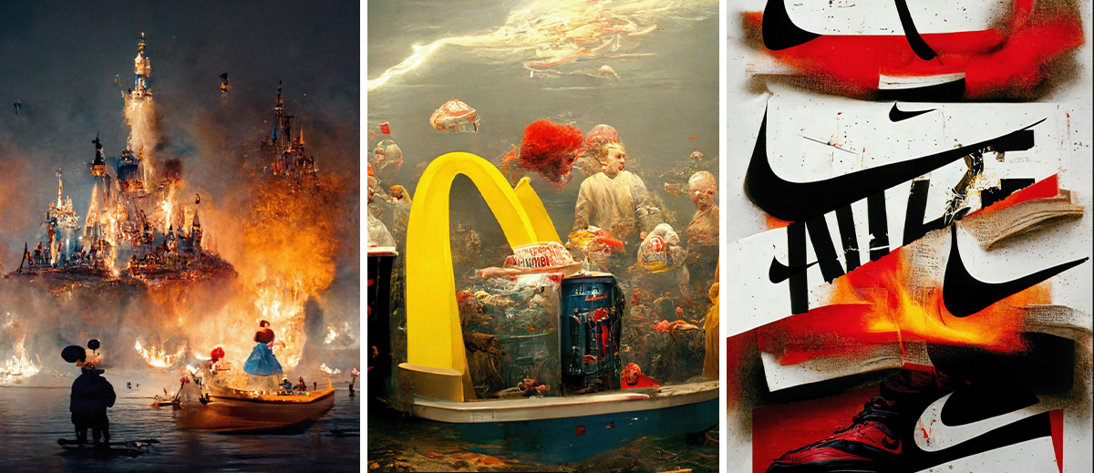
Artificial Intelligence is everywhere now, in all kinds of markets. We see it being used in the form of chatbots, copy development and even within blood analyzing purposes. With this fast-growing use of AI, we are starting to see it within graphic design as well. AI can create interpretations of whatever you like using keywords and algorithms and analyze thousands of images to create new ones. Some creators may fear that AI will take over their profession and make designers obsolete in the future. However, we predict that designers never will go out of style and that soul and heart are necessary for the creation process. Instead, look at AI as a tool for concept creation, brainstorming and idea generation.

Credits: Jeff Han – Mid journey Ai collection

The possibilities of what AI can create within image sketches are endless, the only thing standing in the way is your own imagination. Brand collaboration is another example of how AI can be used. In this case, a creator took this tool to the next level, developing sketches for a fictional collaboration between IKEA and Patagonia only by using keywords in an AI image program. By analyzing the keywords in the AI program and adjusting them the result is both realistic and unique. Another creative use of AI is this interpretation of the population density in different countries.

Credits: Eric Groza – Patagonia+IKEATerence Fosstodon – Population Density Maps

3D elements

It goes without saying that the Metaverse and Virtual Reality have a significant impact on 3D design, both when it comes to moving 360° objects like logotypes as well as static elements with complex shading and detail. With its flexibility, 3D helps us create other realities and perspectives and we predict we’ll see a lot of surrealistic worlds mixed with reality-based elements within this field.

Credits: Joe Mei – Virtual clothing, Paulina Kopijkowska


Featured at Packaging of the World

A fresh new look for ProDen PlaqueOff® packaging range!

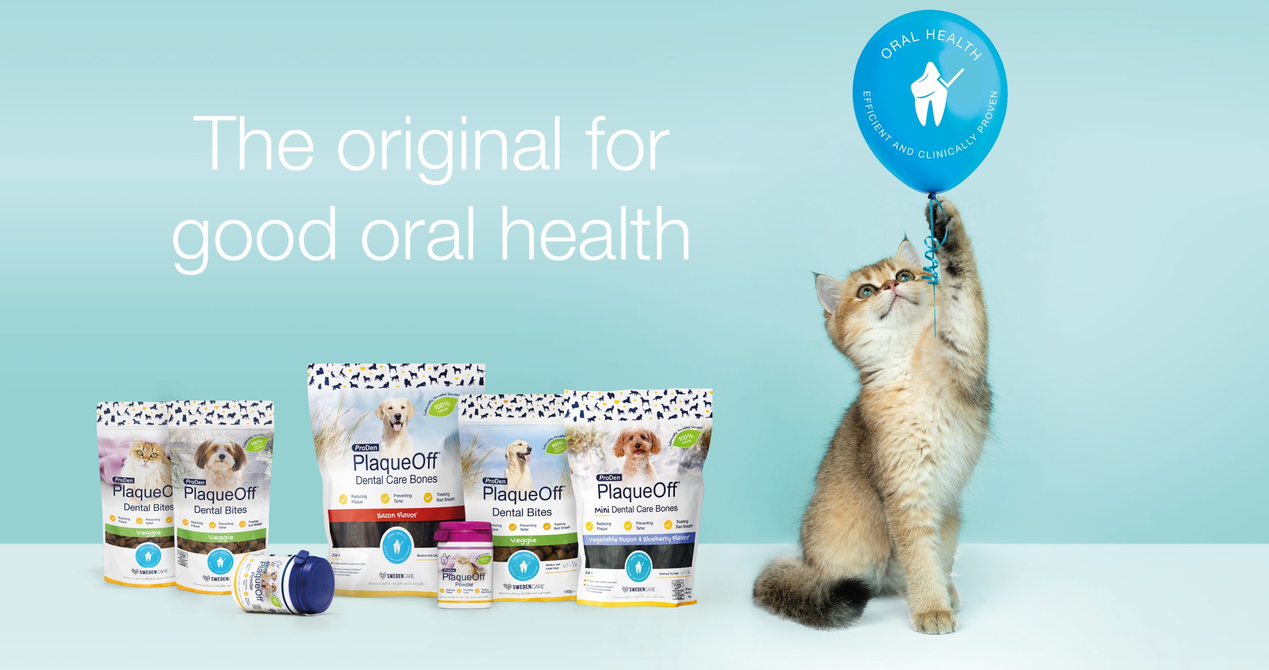
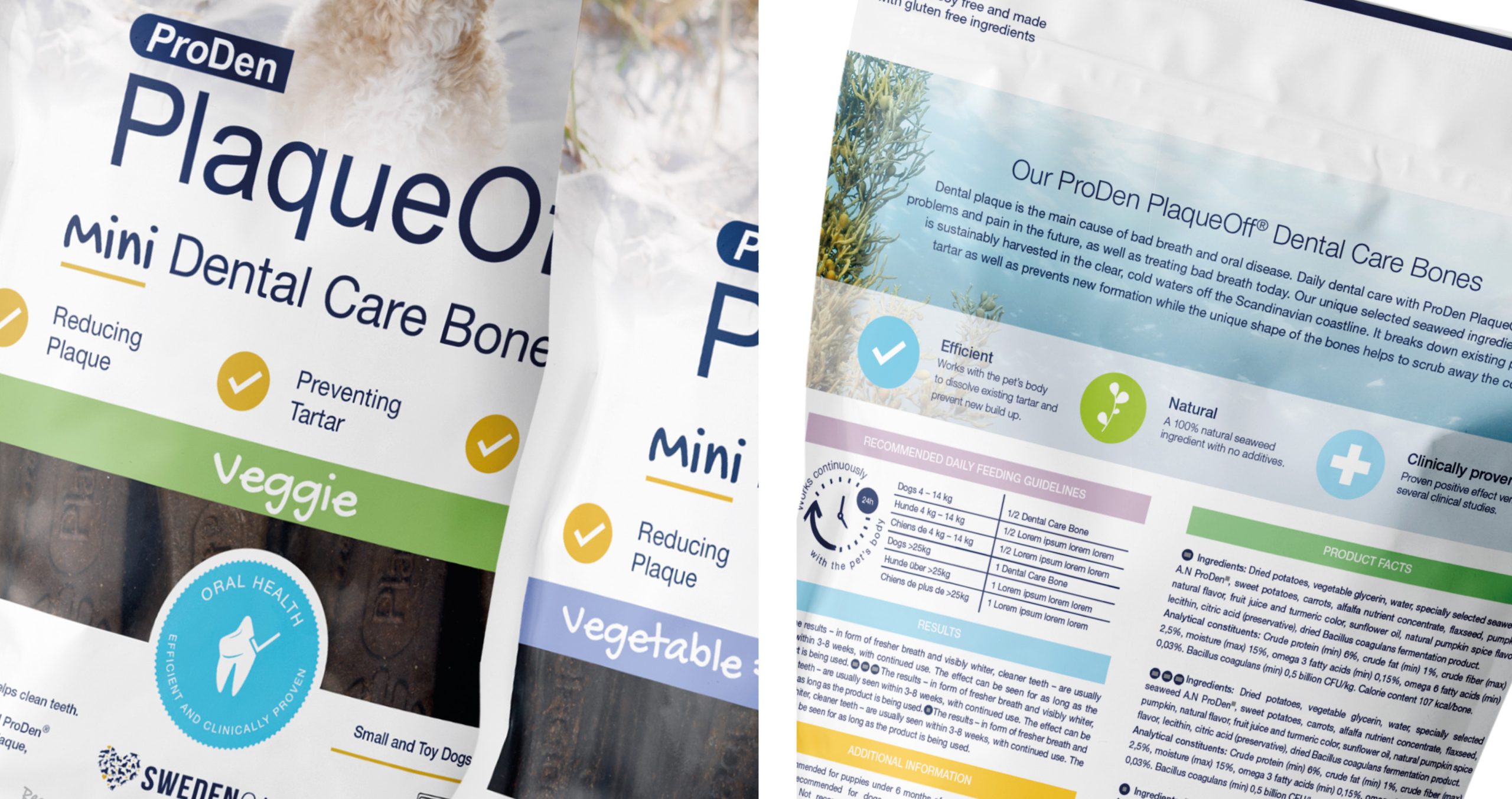
We are happy that Adentity’s new packaging design work for ProDen PlaqueOff®, the flagship product of Swedencare, is featured at Packaging of the World – one of the most prominent packaging design website showcasing the most interesting and creative packaging work worldwide.

The objective of this packaging design project was to redesign the ProDen PlaqueOff® range in line with the new Brand Platform and to celebrate 50 years since the discovery of A.N ProDen® with fresh new packaging.

ProDen PlaqueOff®, developed and distributed by Swedencare, is a natural, efficient, and clinically proven oral care product for pets. For this unique product, Adentity has developed a brand and communication platform with a brand story, a brand concept, and a corporate visual identity with guidelines steering the brand.

View more about the design work at Packaging of the World. Read more about the Swedencare packaging story

Graphic trends – expression, colours and fonts

From dopamine colours to artsy fonts

Let us inspire you with dreamy landscapes, popping colours and unique expressions. We’ve looked into some upcoming and popular graphic trends within colour and typography. Bright and happy colours as well as playful fonts remain popular when it comes to both packaging and web design. We’ve gathered inspiring influences from Art Noveau to graffiti, traditional to modern, softness to boldness. Whether you prefer natural or abstract, classical or innovative – here is something for you to incorporate into your current designs or marketing strategies.

Dreams of colour

Muted colour gradients, grainy textures, and natural light. The concept of Dreamy colours is gaining popularity in both interior design and fashion. This is a trend we see in many aspects of graphic design. With the soft nuances and the midnight feeling, this can be applied to both web and packaging design to create smooth, unique, colour harmony. Consumers are invited to enter into a dreamy and soft universe and step out of their everyday life for a little while. Where imagination, fantasy and aspirations are merged into a dreamy concept.

Credits: Moi inerior, Billie Inc. and Caia cosmetic 

Dopamine colours with simplified graphic design

The opposite of dreamy colours might be the Dopamine trend. Drawing inspiration from both the fifties and seventies, the bright and bold nuances bring joy and liveliness to any category within graphic design. With the popping and fun, contrasting colours we believe this could elevate brands by creating attention within packaging design. Graphic design and illustrations are an important part of the design work, and the magic is to find good colour combinations that are in contrast but look stunning together.

Credits: Poppi and Cocco – The art of chocolate 

Arts & crafts – unique typefaces inspired by Art Noveau

Fonts with a classic feel but with a modern touch. Inspired by Art Nouveau this style is often illustrated and self-designed to create a unique graphical profile. By playing around with fonts in this modern way and connecting them with traditional styles, you can develop new, exciting ways to express your brand.

Credits: Reva skin care and Nicky Laatz

Express yourself with expressive fonts – from Dada to Graffiti

For a powerful statement, try expressive fonts. Combining capital letters with contrasting colours, the text can almost become illegible sometimes- but with the intention to bring attention. Almost an impression of art rather than words, this trend is excessive, but in all the right ways. We can see that this technique has gone from being an expression for graffiti artists – to a modern marketing approach being used in both billboards and packaging design. The fonts are creating movement, contrast and bring youth and innovation to the product and brand.


Credits: Talormade, Brooklyn film festival and Uberdank

Adentity celebrating 20 years in Paris!

Colourful art, culinary experiences, and vibrant street life

Bonjour Paris! We celebrated Adentity’s first 20 years with an inspirational trip to Paris. A homage to team spirit, the joy of creative work and passion for building strong brands. Paris inspired us with its beauty, art, culinary experiences, architecture, and vibrant street life. Come with us to Paris!

Pont Neuf in the soft autumn sun

We crossed la Seine over the beautiful Pont Neuf, taking a moment in the warm, soft autumn sun with La Tour Eiffel on the horizon. The bridge is one of Paris’s oldest bridges with its own exciting history. Pont Neuf is a popular location for both filmmakers, artists, and fashion photographers. In 1985, artists Christo and Jeanne-Claude covered the entire bridge in woven polyamide fabric, known as The Pont Neuf Wrapped.
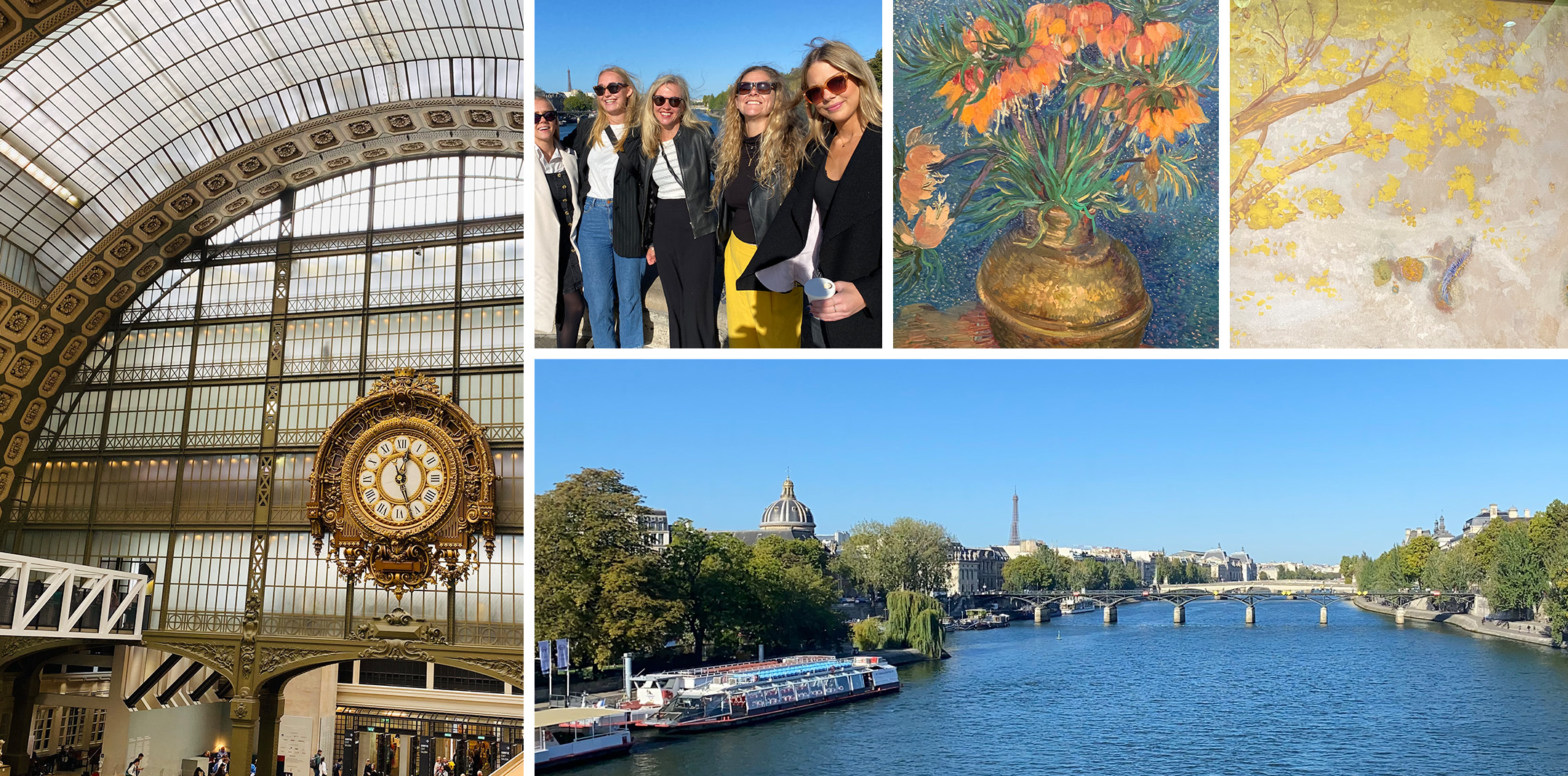
The art museum Musée d’Orsay – Impressionism and Avant-garde

Our first port of call was the Musee d’Orsay. Once upon a time, this building was a train station, the Gare d’Orsay, that was later turned into an art museum. Now it is one of Paris’s most unique museum buildings. Adentity started our visit on the fifth floor, with the great works of Van Gogh, Monet, Renoir, Degas and many more. We passed through the phases of Impressionism, Post-impressionism, and Avant-garde filmmaking. Exploring how Paris has been the centre of so many art movements and eras.

French culinary experience in Saint-Germain

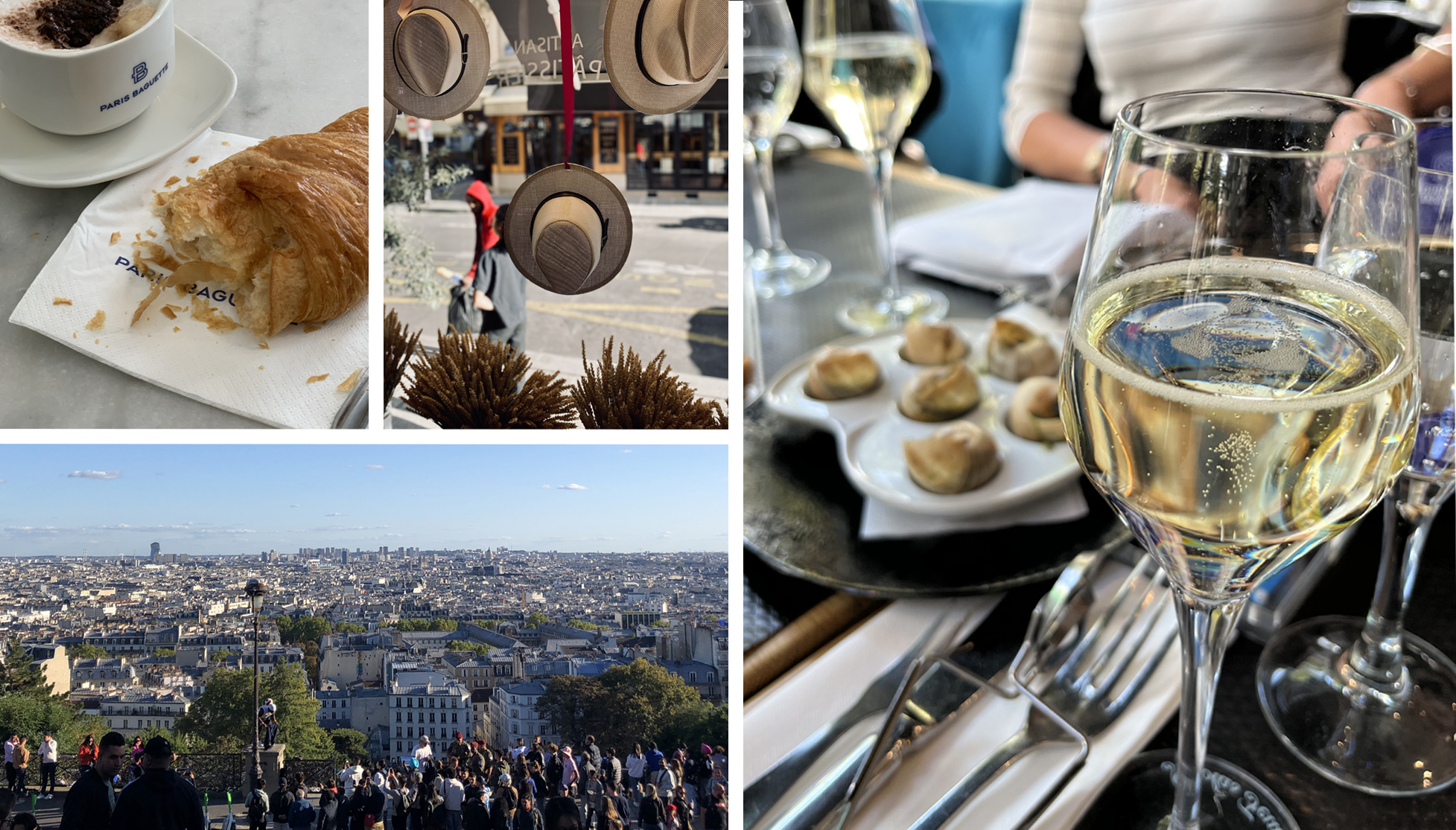
Great art creates great appetite, so it was time for a proper Parisian lunch. We found a perfect place in St Germaine, where we feasted on a starter of classic snails soaked in garlic butter with baguettes whilst digesting the artistic influences from Musée d’Orsay.


Paris – Turning buildings into advertising

Paris is a city that knows how to use every building renovation project as an advertisement opportunity. During renovation the buildings are wrapped, cleverly hiding the messy construction project behind and providing a huge space for advertisements. Seen by thousands of Parisians and visitors passing by, the artwork on these mega-size panels is well executed with high quality design and print techniques making them really stand out.We photographed a few during our trip to Paris. The ”Cloud-ad” for Louis Vuitton was visible all over Paris.

La Basilique du Sacre Cœur with Montmartre ambience

After a short metro ride, we arrived at Chateaux Rouge where we walked up the hill to la Basilique du Sacre-Coeur and enjoyed the great view over Paris. Under the clear Saturday sky, we sat down for a relaxing break on the stairs enjoy the vibrant life around us and being entertained by a young man doing the most fantastic football tricks whilst hanging from a lamppost!

As the sun began to set, we wandered through Montmartre feeling the ambience of streets lined with small houses and the heritage of great artists. Picasso had his first studio in Montmartre at the Rue Gabrielle, also Renoir, Van Gogh and Toulouse-Lautrec had their homes close by.

Celebration Dinner at le Camondo

The restaurant La Camondo is situated in a beautiful Parisian Villa near the Park Monceau in the 8th arrondissement. We had a delicious dinner there with French Cuisine. It was a joyful evening with fun stories of memories and adventures we have experienced together at Adentity.

A fashion walk in the night – from Valentino to Gucci

In a strong, colourful light in a variety of colours from purple, pink, blue and green, the fashion houses presented the clothes for the upcoming winter season. Gucci’s green mega-sized installation for promoting the Gucci Bamboo 1947 bag caught our eye. The entire installation was made only of small, spring-green coloured balls that together created a 3D effect.


Paris landmark number one – La tour Eiffel

Paris was glittering below our feet and the fantastic view from the top made us breathless. The Eiffel Tower or La Dame de Fer – the iron lady – is a true symbol of Paris, and quite extraordinary in the world of marketing.

It is a city landmark like no other. The tower has been at the centre of lots of creative work since it was built in 1889. For example, the French car brand Citroën has used the Eiffel Tower for celebrating their concept of Créative Technologie in several campaigns over the years.

Between 1925 and 1934 the Eiffel Tower served as a marketing pillar for the brand. Using 250 000 lights to form the letters of Citroën, they managed to turn the whole tower in an advert. The Guinness Book of World Records actually recorded the Eiffel Tower as the world’s largest advertisement. There are no limits in the world of creativity – everything is possible.

Looking forward to the next 20 years

After some wonderful days in Paris, the entire Adentity team felt boosted with inspiration, ready to take on new marketing challenges. We certainly look forward to the next exciting 20 years!

Au revoir, Paris! A bientôt.

Los Angeles inspiration

Image: Adentity, Venice Beach

Where do you go to get inspired when it comes to movies and creative productions? Yes, you are right. To LA. Adentity went to LA to get inspired in the City of Angels. In this post, we would like to share some of the LA inspiration. From 3D screens and graphic design to how to connect offline with online media through both layout and the love for QR codes.
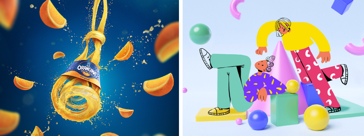
Full 3D experience – Hollywood film legacy

Forget the 3D glasses. Enjoy the full 3D film experience at Los Angeles International Airport instead. The airport elevator turns into a historic high-rise building with full action and vivid acrobatic. This impressive 3D installation catches the attention of travellers. By taking the old silent movie and turning it into a 3D experience, it captures the soul of LA and Hollywood, connecting the past with the future.

The use of the latest 3D movie screen technology enables new creative opportunities. New kinds of open spaces – from retail to fairs and offices – can now act as attention and branding billboards.
Take a look and get inspired!

LA, LA, LA  –  graphic letter design on repeat

With clean typography and playfulness in the colour palette, these letter graphics catch the eye. The use of different shades creates a dynamic in the graphic layout. In the middle of the layout, you find a QR code to navigate you further in the social media landscape.

Image:  Adentity, Los Angeles

LA in love with QR codes

Everywhere in LA, QR codes are used. They are a natural part of all types of consumer marketing. The QR codes redirect customers to social media pages and are both smart and convenient.

QR-code stands for Quick Response and is a matrix barcode offering a short track for the consumer to more information on a webpage. When QR codes first appeared in marketing and product communication it took a couple of years before consumers started using them in daily life.

The development was boosted by the introduction of Smartphones, although the very first QR codes came already in 1994. The innovation originated from a Japanese automotive company, Denso Wave, to speed up their manufacturing process. It is interesting how technology and marketing go hand in hand, and how deep LA has fallen in love with QR codes.

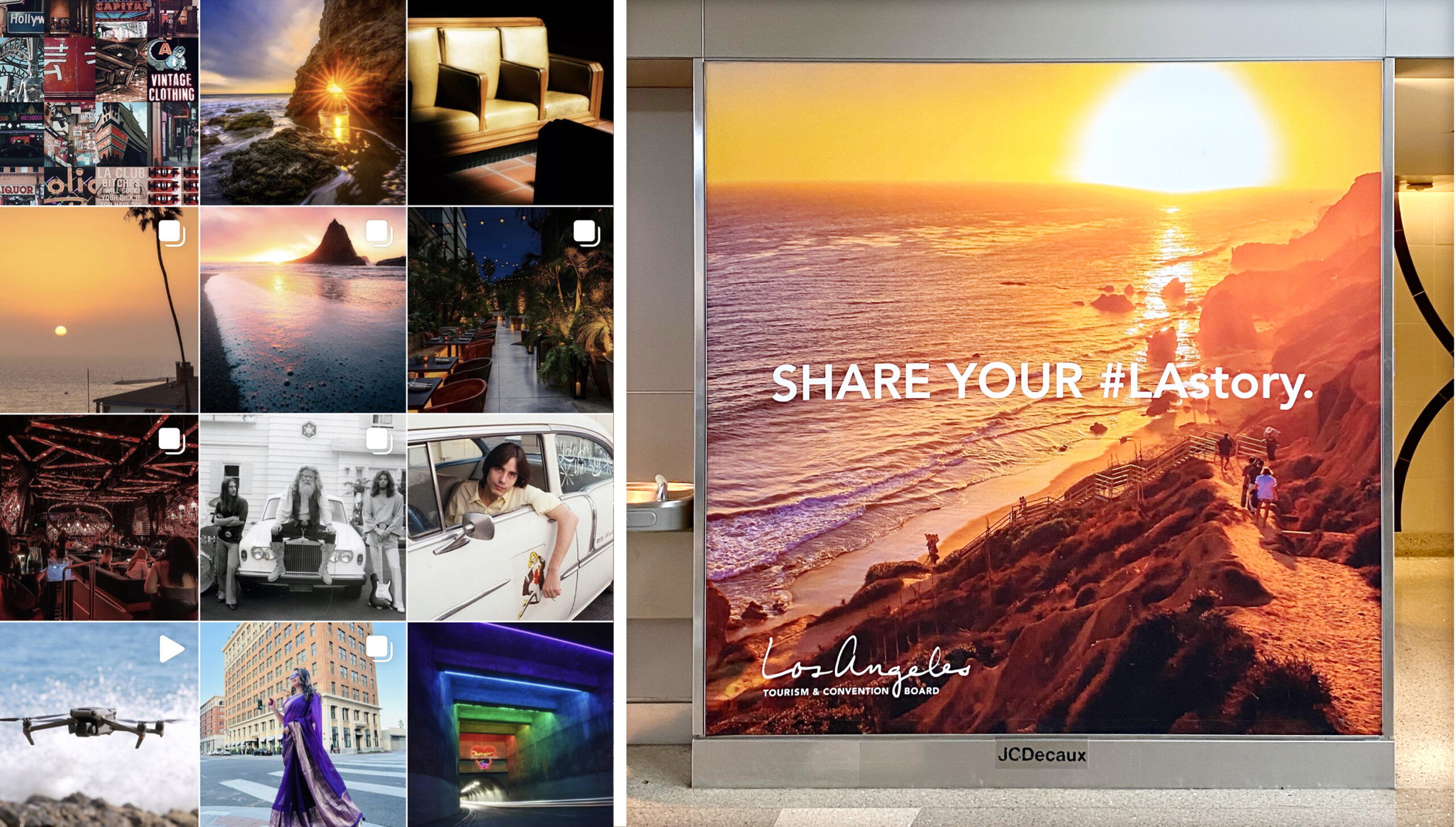
Share your #LAstory

Time to share your LA story! The offline world gets connected with the online world. This large format poster borrows its inspiration from the Instagram universe, with an aspirational photo that catches the eye and a clear call to action promoting the hashtag. Simple and clean – Share your best LA Story to inspire others. There are almost 600 000 stories on Instagram connected to the hashtag.

#LAstory

La Biennale di Venezia

Biennale Arte – The milk of dreams

The 59th International Art Exhibition just opened up at Giardini and Arsenale in Venice. The Biennale Arte 2022 in Venice has chosen the theme – ”The Milk of Dreams”. Inspired by the book title “The Milk of Dreams” by the Surrealist artist Leonora Carrington (1917–2011).

”The Exhibition
takes Leonora Carrington’s otherworldly creatures, along with other figures of transformation, as companions on an imaginary journey through the metamorphoses of bodies and definitions of the human.”

Here is a sneak peek of the artists displayed at the Biennale:

Credits: Jonathas de Andrade, Simone Leigh, Wu Tsang of Whales, Ulla Wiggen (venice.art.biennale)

The curator of the exhibition, Cecilia Alemani, says to the Art Newspaper: “I wanted to use this atmosphere and this fluidity to create an exhibition that talks about metamorphosis of the body, and of the definitions of humanity”. It is an impressive amount of art that is presented:  213 artists from 58 countries; 180 of these are participating for the first time in the International Exhibition. In total there are 1433 works and objects on display – which is quite impressive.

Credits: Globestyles & Adentity

Sources and read more at Designboom, La Biennale and The Art Newspaper

Graphic design trends in 2022

Youthful expressions that catches the eye

This year, styles from across the decades are coming back to life in a new twist and creative form. Trends tend to be cyclical and come back and evolve. This is something we like about graphic design, the rediscovering and reimagining of old favourites. 

We’ve looked into upcoming trends in the graphic design world and have gathered some inspiring trends within style and colour for 2022. We also included some examples from major brands like Kellogs, Coca Cola and Burger King that have explored new youthful expressions in line with these trends.

90’s nostalgia and retro style in a fresh take

90s style is an era of sweet nostalgia that is coming back to give people a well-familiar sense of bubblegum colours, grainy textures, pixelated art and retro illustrations. Major brands like Coca Cola and Burger King have adapted the retro vibe, expressing it in a modern and fresh way.

See more at: itsnicethat, clio

Muted colours for an organic and calm design

Muted colours are essentially vivid colours that have had their edge taken off. Muted colors are incorporated more on the web and even in packaging. Perhaps because they tend to give off an organic, calm vibe and blend well with a light or dark text when used as a base.

See more at: design & paper, Landor

Combining 3D and flat design for catching the eye

3D is a growing form of style that is opening up its arms to anyone that’s up for a try. As it offers limitless possibilities to designers, it gives room for anything you can imagine. We see many creators combining flat designs with a pop of 3D elements to create depth, as well as stand out and create attention.

See more at: Behance, Dribble

Milan Design Week 2021

Nature, craftmanship and soft pastels –  with strong sustainability manifestos

What is going on in the Supersalone in Milan? The world’s biggest annual design gathering just took place in Milan. We took a sneak peak what is going on in the Salone del Mobile – the furniture fair that is the key event during the Design week. Designs in focus celebrated nature, craftsmanship, soft pastels but with strong sustainability manifestos. According to Eclectic Trends, sustainability was the overriding message at the fair. Company manifestos like “Going greener”, “Second life”, “Renew our connection with nature” adorned the Salone’s walls and booths.

Kaarigari by Rashmi Bidasaria

Rashmi Bidararia encoded the movements of block printing artisans into a visual data – channelling their unique signature styles. The project pays homage to the craftsmen and their work in a beautiful execution.

Hypatia Project by Tair Almor

The Hypatia Project was born out of answers from 100 women about their body, nudity, pain and pleasure. From the sequence of answers from each woman, Tair Almor created a unique ceramic vase using modular molds, telling the story of each woman’s experience of the female body.

Seam of Skin by Chiaki Yoshihara

Interior and product designer Chiaki Yoshihara presented Seam of Skin, a furniture collection born from a unique process. Yoshihara has taken polystyrene foam and turned it into furniture with a wood grain-like texture and sheer pastel colours. For the chairs and stools, Yoshihara used polystyrene for its insulation properties together with actual wood, so heat doesn’t escape and the seating surface feels warm.

I’ll be your mirror by Josephine Akvama Hoffmeyer and Elisa Ossino

I’ll Be Your Mirror is a colourful yet calm installation staged throughout a Milanese apartment, featuring contemporary frescoes, classic Scandinavian furniture and mirrored surfaces. The designers said:
“While the balance of material, colors and texture lay at the very surface of interior, we urge spectators to contemplateon their own significance and appearance within space and time.” 

The Venus power collection from Patricia Urquiola

Venus Power is a collection of rugs by Patricia Urquiola created for Italian design company cc-tapis. The collaboration between designer and maker explores the idea that all people, regardless of gender, carry a level of femininity within them, and encourages it to be embraced, listened to and accepted. The idea is expressed through the metaphor “We all come from Venus”.


From powerful paintings at Louisiana Museum of Modern Art to vibrant Copenhagen

Powerful paintings at Louisiana Museum of Modern Art! Adentity enjoyed an inspirational day together in Denmark, visiting the Swedish artist Mamma Andersson exhibition drawing inspiration from her colours and interpretation of Scandinavian nature and life. We also enjoyed some traditional Danish pastries and ate lunch by the glittering waters of Öresund. Then Copenhagen welcomed us at the end of the day with a vibrant city feeling as Denmark opened up lifting all remaining Covid restrictions. A day filled with inspiration, energy and joy!

Our first stop – a traditional Danish Bakery in Humlebæk

After jumping off the train in Humlebæk, we made our first stop at a traditional bakery nearby the train station to enjoy some Danish pastries. It was a great start to sit outside in the warm morning sun whilst enjoying coffee and pastries.

The glittering waters of Öresund

Below the edge of the museum lies the beautiful waters of Öresund. When looking out over the water’s edge we spotted an arty jetty made of concrete and wood. The Louisiana surroundings interact harmoniously with the art inside it, creating a perfect place to gather inspiration.

The Swedish artist Mamma Andersson inspires with nature

We visited the exhibition of the Swedish artist Karin Mamma Andersson (Born 1962 in Luleå). She ranks as one of the most important painters of her generation. Classical painting is at the heart of Mamma Andersson’s work, however, Mamma Andersson has developed a personal take on the classical genres of painting, by using a sharp sense of mood, colour, and materials. Still lifes, interiors and landscapes are at the centre of her creations, made with powerful colours and a distinctive rawness. She works with layers and combinations of materials, which creates richness and depth. There are also small stories and references hidden in the paintings which create interest and something unexpected for the viewer. The exhibition is a mix of new pieces made especially for the occasion, and gathered artwork from different places around the world, for instance The Little Sister II, that is displayed in Centre Pompidou in Paris.

Für Elise (2016) and About a girl (2005)

Copenhagen – A day when everything opened up

We then headed for Copenhagen by train. It was a sunny and vibrant Copenhagen that welcomed us with a hubbub of movement and people on the go. We started with drinks at the historical and colourful Gråbrødretorv that dates back to the 13th century. The square provided a great atmosphere and feelings of joy as this was the day Denmark opened up after lifting the Covid-19 restrictions. You can read more about Louisiana and the exhibitions here.


Graphic design inspiration 2021

Graphic design is a constant changing field with new ideas and visual styles, always looking for new ways to evolve and advance. That is why every year there are new or altered graphic design trends appearing. In this article, we introduce some of the exciting trends for 2021 that are being used more frequently in the industry.

Graphic design trend – Groovy fonts on display

Typography is an ever-changing field with endless possibilities for experiment and development. Last year, we were making fonts bold and magnetic. In 2021 designers are searching for something new and different. This year will give us more extraordinary display typefaces with geometrical dimensions and 3D fonts in acid colour palettes and gradients. When building a brand, the typography is important. To develop a font uniquely designed for your brand is a great way to create a unique expression and make people recognize you in the crowd.

See more at Oberlo, Studio Aurora, Dualist

Get inspired from A to Z!

We love to explore typography and get inspired by expressive and creative fonts. The project 36 days of type combines passion for graphic design together with the letters and numbers of the Latin alphabet. Designers, illustrators and graphic artists are each year challenged to design a letter or number each day for 36 days. The result? Beautiful, inspiring interpretations of the same symbols from thousands different perspectives.

See more at 36 days of type

Graphic design trend – Go monochrome or duotone?

Duotone design refers to creations that are made up of two contrasting colors, while monochrome design refers to the use of varying tones of a single color. These two ways of expressing colour, we see are getting a push this year. Monochrome and duotone designs are being used in online campaigns and advertisement as well as in packaging and product design.

See more at Sammontana Gruvi, DesignboldKolorlessSpotify

Graphic design trend – The dark mode

Dark UI design is a trend that’s growing fast! The use of dark mode in UI design is increasing since more and more users around the world prefer a dark interface before a bright. A dark mode is a useful option for when you want to draw attention to the content, for example reading, music apps and productivity software. Both Apple and Google have incorporated a dark theme in their user interfaces. A muted design helps focus attention and enhance accessibility more than a bright design does.

See more at Imam Abdul Azis, Elena Zelova, Ariuka 

What trends will you incorporate in your designs in 2021?

Barilla refreshes the blue brand colour and packaging design

Inspired by the Italian sky on a summer’s day

Adentity recently visited Milan and spotted the new, lighter blue Barilla packaging design that is launched in Italy. The new Barilla blue is inspired by the Italian sky on a summer’s day. FutureBrand that is the agency behind the rebranding work explains the new blue like this:

”That special hue of blue of the Italian sky on a summer’s day has been transferred to the Barilla pasta packaging. The packaging says farewell to Barilla’s traditional blue for a lighter shade full of emotion and generosity. Today, that light blue characterises Barilla packaging all over the world, celebrating the Italianness of the most loved pasta brand.” 


Barilla brand colours – red, white, and blue

Barilla’s traditional three brand colours are red, white and dark blue. The red, white and blue colour palette of the Barilla visual identity is a representation of the passion, love, and professionalism of the Italian company and its values of the customers’ happiness and well-being. We think a fresh, new packaging design is a great move for Barilla to make, since it is a refreshment to the brand in line with the heritage, focusing on emotions and highlighting the Barilla story and its love for pasta.

A new fresher pasta packaging range

Apart from the colour being replaced with a lighter shade of blue, there are some other exciting changes to the Barilla packaging. The new pasta box is made of virgin cardboard fiber which is a sustainable and recyclable material, and the plastic window has been removed in some markets like UK, which shows a sustainable mindset at Barilla. Also, the pasta will now be produced with 100% Italian wheat, and a new icon has been introduced to highlight this.

Before the redesign of the Blue packaging colour

You probably recognize the old Barilla packaging, since it is a product and design that lasted virtually 30 years. We look forward to seeing the new packaging in shelves all around the world!


Read more at FutureBrand, Barilla, Behance and Packly blog