Author: admin

Rosti sustainable branding platform

Unique, authentic and forward-looking

Together with the Rosti Group, Adentity has created a new sustainability-focused brand platform and concept, encompassing everything from an engaging brand story and a clear brand framework to a revitalised visual identity.

Bringing the concept “Shaping sustainable solutions for tomorrow” to life, we created a brand positioning and unique visuals that connect sustainability efforts worldwide to strategy development, concept creation, goals, progress, and the people of Rosti. The work highlights Rosti’s 2030 sustainability commitments.

The brand platform includes a brand storybook, a framework for the Sustainability Report, concept artworks, photography, illustrations, and key messages. These materials are designed for use across digital channels, at trade events, and in industry press.

This journey has been a true collaboration, from a global pre-study with interviews conducted worldwide to strategy development, concept creation, and communication – proving that every step counts in achieving a strong and meaningful result.

Discover more and get inspired by our brand strategy and concept work, as well as internal and external launch activities.

here: Rosti Sustainable Branding Platform

ADENTITY SUSTAINABLE BRANDING

BRINGING THE GREEN STORY TO LIFE

We bring the green story to life by establishing a strong market position built on authenticity, transparency, and verifiability throughout the value chain. With a communication platform, we develop a strategy that leads to narratives and stories based on the brand essence, with sustainability as one of the core pillars. The story comes to life through concepts and campaigns where sustainability is seamlessly integrated into the marketing.


Trend watch 2026: Designing for realness and warmth

What will visual communication look like when emotion leads the way?

At Adentity, we see 2026 as a turning point. Brands are embracing more human, expressive and grounded ways of communicating. We’re seeing everything from candid camera-roll-like imagery to warmer, more tactile design inspired by craft and heritage.

In our Trend Watch for 2026, we explore the creative directions shaping how brands will look, feel and communicate in the year ahead. From honest, unfiltered moments to expressive digital distortion and intentional slowness, these trends reflect a growing desire for authenticity, texture and emotional connection.


CANDID CAMERA ROLL – Real, honest and human

We’re seeing a strong shift towards visuals that feel unfiltered and honest. Candid Camera Roll captures moments as they truly are, imperfect and spontaneous. Think blurry film textures and harsh flash photography, creating an aesthetic that feels immediate, intimate, and almost accidental. What makes this trend powerful is the tension between appearance and intent. While the visuals look messy and unplanned, the authenticity is anything but random.

We believe this trend resonates because it redefines what authenticity looks like, not as something accidental, but as something intentionally designed. Impact no longer comes from perfection alone, but from knowing what to strip back and what to amplify.

A restaurant might use candid flash photography for social content, while a retail brand pairs blurry film imagery. Different businesses can work with unpolished, unstaged visuals when guided by a clear creative direction that keeps the brand consistent, credible and recognisable. For us, this trend proves that relatability will outperform perfection in 2026.

CLIP DIGITAL DESIGN – bold expression with raw energy

Building on the same desire for imperfection and emotional honesty, Clip Digital Design takes the rawness of Candid Camera Roll and pushes it into graphic form. Where candid photography captures reality as it unfolds, this trend reconstructs it, but in a deliberately distorted form.

Often referred to as Distorted Craft, Clip Digital Design embraces chaos: fragmented photography, clashing layers, distorted proportions and sharp, angular shapes. It’s expressive, energetic and intentionally messy. By introducing subtle elements, as angular cut-outs in packaging, collaged textures in campaigns or layered typography, brands can translate the same sense of authenticity into bolder visuals. In Clip Digital Design distortion becomes a creative tool rather than a flaw, and imperfection turns into a strategy for standing out.


ELEMENTAL FOLK – modern design rooted in heritage

After years of digital minimalism, 2026 also brings a shift towards something slower, warmer and more tactile. Elemental Folk draws inspiration from traditional folk art and regional craftsmanship, reinterpreted through a modern design lens.

Hand-drawn florals, animals and symbolic motifs meet clean layouts and digital graphics. Rich tones balance earthy neutrals, while rustic, handcrafted typography adds warmth and authenticity.People are now craving meaning, history and connection. Brands that reference cultural heritage, without feeling outdated, can create trust and emotional depth. For us, Elemental Folk is about designing with soul.

FILM PHOTO – nostalgia and intentional slowness

Alongside candid photography, we see a renewed love for Film Photo, not as a nostalgic gimmick, but as a conscious design choice. Film photography brings grain, soft focus and imperfect exposure into brand visuals, creating depth and tactility.

For us, Film Photo represents a shift towards intentional slowness. In an era of endless content and instant visuals, film signals presence and authenticity. Brands using film photography, or film-inspired treatments, feel more considered and emotionally rich.This trend works across industries. Fashion and lifestyle brands can use film to elevate storytelling, while restaurants, hotels and local businesses can create atmosphere and intimacy. Even digital-first brands can apply film textures, muted tones or subtle grain to soften their visual identity.

Our conclusion is that Film Photo isn’t about looking old, it’s about feeling real, timeless and human in a fast-moving digital world.

Across all these trends, one thing is clear: 2026 is about embracing imperfection, expression and emotion. Whether through raw photography, distorted compositions or heritage-inspired details, brands are moving closer to real people and further away from generic perfection. We see these trends as tools, used thoughtfully, they help brands feel relevant, credible and emotionally connected in a rapidly changing visual landscape.

Sources: VistaprintDigitalsynopsis

Embrace the power of sustainability

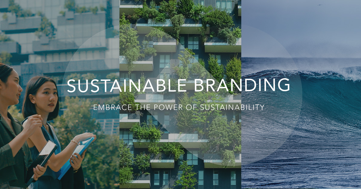
In today’s competitive market, embracing sustainability is essential for every brand. By seamlessly integrating sustainability into all aspects of communication, a brand can gain a substantial advantage. This approach not only creates a positive impact but also positions the brand for long-term success.

A TRUSTWORTHY POSITION FOR A COMPETITIVE ADVANTAGE

Adentity has 20 years of experience integrating sustainable innovation with marketing to establish a strong market position. We have expertise in incorporating sustainable innovation and branding into communication platforms, CSR initiatives, campaigns, and events to convey the brand’s sustainable story effectively. With an integrated approach, we can help brands establish a meaningful position that gives them a competitive edge. 

A COMMITMENT, NOT A BUZZWORD

For a brand to adopt a sustainable approach, it is about integrating environmental, economic, and social issues – the entire chain – into its business process. With sustainable branding, the goal is to incorporate sustainability into the brand’s authentic identity. Therefore, the brand’s marketing messages must align with the company’s genuine and verifiable commitment to sustainability. Beyond aligning messages, brands must engage in continuous dialogue with their stakeholders, be transparent about challenges and progress, and demonstrate tangible actions that reflect their commitment to sustainability. This approach ensures that sustainability becomes an integral part of the brand’s DNA, driving long-term positive impact.

THE CLIMATE SETS THE AGENDA 

Several aspects drive the sustainability focus forward, with climate change being a prominent driving force. Legislation and international agreements, such as the UN goals, the Paris Climate Agreement, and COP, are strong driving forces for finding new solutions. Compliance reporting is a tool that ensures companies adhere to and implement solutions in their operations. It involves systematically tracking, documenting, and reporting an organisation’s adherence to sustainability standards and targets. This process not only aids in transparency and accountability but also enables companies to demonstrate their commitment to reducing their environmental impact. 

NEW BUSINESS AND CONSUMER LOGICS

Technology advances with innovations in various sectors. Still, it is most noticeable in the energy sector, where renewable energy and a focus on sustainable cities are starting to create a new business logic. Changing consumption patterns that require a sustainability approach is also vital. This trend is shifting away from a throwaway society, toward more sustainable consumerism. Younger generations, including Gen Z and Alpha, are promoting different values and consumer behaviours, transforming our society for the future. This generational shift in values and behaviours is not just a trend but a powerful force reshaping industries, influencing corporate strategies, and fostering a more sustainable and equitable future for all.


WE INTEGRATE SUSTAINABILITY WITH BRANDING

Adentity has experience working with sustainable innovation, the environment, and integrating clients’ business strategies into branding and marketing materials. We build on the brand’s authentic profile and turn it into effective communication, creating a profound brand position and a competitive advantage. This involves working with different stakeholders, analysing and researching in a process-oriented and structured way, and integrating sustainability into platforms, concepts, and campaigns. Creating trust through proof and understanding how to work with a brand through this process is at the heart of what we do.

We bring the green story to life by establishing a strong market position built on authenticity, transparency, and verifiability throughout the entire value chain.

With a sustainable branding platform, we develop a strategy that leads to narratives and stories based on the brand essence, with sustainability as one of the core pillars. The story comes to life through concepts and campaigns where sustainability is seamlessly integrated into the marketing.

To visualise and communicate the vision of green transformation, we translate facts into engaging icons, illustrations, and messages to make it clear and visually appealing. We adopt a different perspective and a process-oriented approach, utilising platforms, concepts, and campaigns through workshops, business analysis, trends, research, and various channels as tools that involve all stakeholders.

At its core, sustainable marketing creates value for customers, society, and the environment simultaneously. Together, we can find an optimistic way forward and confidently bring the green story to life!


SUSTAINABLE BRANDING WORK

Below are several cases demonstrating how sustainability can be integrated into all aspects of branding and marketing.
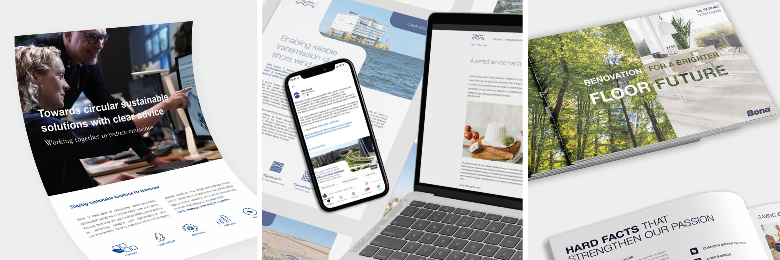
Alfa Laval

Alfa Laval is driving the advancement of future heat transfer technology. Adentity has worked closely with Alfa Laval on several projects, including developing the overall conceptual framework for the “Driving the Future in Heat Transfer Technologies” campaign.  

Bona

Adentity worked closely with Bona’s marketing and corporate communications to build an integrated communication and brand platform. This included the development of Bona’s environmental platform, “On Track for Sustainability.” Adentity also presented the outcomes of Bona’s value chain analysis with the Swedish Environmental Institute and explained new EMICODE regulations by using clear visuals, messaging, and key graphics. 

Rosti

Together with the Rosti Group, Adentity has created a new sustainability-focused brand platform and concept, encompassing everything from an engaging brand story and a clear brand framework to a revitalised visual identity. To bring the new concept “Shaping sustainable solutions for tomorrow” to life, we conveyed a clear brand positioning and distinctive visuals – connecting sustainability efforts worldwide to strategy development, concept creation, goals, progress, and the people of Rosti. The work highlights Rosti’s 2030 sustainability commitments.

The brand platform includes a brand storybook, a framework for the Sustainability Report, concept artworks, visuals, illustrations, and key messages. These materials are designed for use across digital channels, at trade events, and in industry press.

Tetra Pak

Tetra Pak, a global leader in packaging and processing technology, launched Tetra Recart: an innovative, sustainable food packaging for canned goods. Adentity created brand communication concepts to highlight its benefits and support its new market position.


16 Years of Support for Kampi Ya Moto!

MAKING A DIFFERENCE FOR THE CHILDREN

For the sixteenth consecutive year, we at Adentity are proud to produce and print the annual calendar for Kampi Ya Motos Barn, a Swedish non-profit foundation supporting the children’s home and school in Kampi Ya Moto, Kenya.

All revenue from the calendar sales goes directly to the home, helping to provide food, education and a safe environment for the children, at no cost to the organisation.

Last year, we travelled to Kenya to see the impact of this work first-hand. We met the inspiring founder, Jacinta, the dedicated staff, and all the amazing children. Seeing the school and the self-sufficient farm made our long-term partnership more meaningful. The orphanage is now a lively, self-sustaining environment where children aged 0 to 18 receive shelter, education, care, and hope for a brighter future.

During our stay, we observed daily life at the orphanage, ranging from school lessons and shared meals to impressive agricultural activities that foster self-reliance. The children and staff grow crops, care for cows, pigs, goats, and chickens, and draw clean water from their wells. Younger children attend the on-site school, while older students pursue their education through sponsored programmes outside the orphanage.

A highlight of our visit was spending time with the children, playing and sharing stories. Thanks to the generous contribution from Jabadabado, we also managed to bring colourful toys from Sweden, which were met with great excitement and happiness. Our visit to Kampi Ya Moto reinforced the importance of ongoing commitment and collaboration. It served as a reminder that even small actions, sustained over time, can have a meaningful impact. We return inspired and deeply proud to support a place where care, hope, and opportunity truly come to life.

Kampi Ya Motos Barn was founded in Sweden to secure a brighter future for vulnerable children in the region. The foundation gives hope and opportunity through education, healthcare, and daily support. We at Adentity are honoured to continue this long-term partnership as part of our CSR efforts and to play a small part in helping the Kampi Ya Motos children grow and thrive.

For more information about Kampi ya Motos Barn and how you can support Phyllis Memorial Children’s Home and Academy, visit kampiyamotosbarn.se.

Adentity Kick Off in Copenhagen


A day of inspiration, culture, and connection

Come with us to Copenhagen!

Our team crossed the bridge for the Adentity kick off. We started with breakfast at Sankt Jacobs Stenungsbageri, where we had great conversations. From there, we moved from the warmth of bread and conversation to the world of art and reflection at the ARKEN Museum of Modern Art. The walk from Ishøj station became part of the experience, following ARKENWALK Jeppe Hein’s playful trail of neon-red lamps guiding visitors toward the museum. Located by the sea, ARKEN is one of Denmark’s most important cultural venues, designed by architect Søren Robert Lund as a contemporary “ark” washed up on the shore. Here we enjoyed a beautiful lunch with a view of the water before heading back into the vibrant pulse of Copenhagen. At HAY’s Concept Store, we explored Scandinavian aesthetics and design ideas. As the day ended, we gathered at The Roof, one of Copenhagen’s rooftop restaurants with sweeping views over the city. It was the perfect setting to reflect and enjoy a good time together.

Sankt Jacobs – Conversations rise with the sourdough 

Every great team journey begins with shared moments. Ours started in the most Copenhagen way possible: fresh coffee and warm sourdough at Sankt Jacobs Stenungsbageri. Known for legendary cardamom buns and perfectly baked loaves, this set the tone for the day—simple pleasures shared together, sparking energy for what was to come.

Arken Museum of Modern Art – Where creativity meets reflection

From there, we shifted from the warmth of bread and conversation to the world of art and reflection at ARKEN Museum of Modern Art. Located by the sea in Ishøj, ARKEN is one of Denmark’s most important cultural venues, designed by architect Søren Robert Lund as a modern “ark” washed up on the shore.

Before reaching the museum, we chose to walk from Ishøj station, following ARKENWALK, a permanent installation by Danish artist Jeppe Hein. Thirty-two streetlamps, each bent and curved into different shapes and painted in neon red, guided us along the path. What could have been an ordinary stroll became a creative experience – an unexpected introduction to the art waiting at ARKEN.

Read more: ArkenArkenwalk

Exploring the exhibitions

With that first artistic encounter fresh in mind, we moved into the galleries to immerse ourselfs in two remarkable exhibitions:

TORECHES by Marguerite Humeau: A sensorial opera that imagines new ecologies and collective futures.

ALL WALKS OF LIFE by Frederik Næblerød: A vibrant, energetic universe that reinvents form, medium, and narrative.

After exploring the exhibitions, we sat down for lunch in ARKEN’s light-filled restaurant, where floor-to-ceiling windows open onto the sea and the surrounding landscape. Over plates of perfectly cooked salmon, we enjoyed the view – a setting that made the meal as memorable as the art.

Scandinavian aesthetics – Ideas shaped into form

Our journey then brought us back into the vibrant pulse of Copenhagen, where design is not just a product but a way of life. At HAY’s Concept Store, we explored the intersection of creativity, functionality, and Scandinavian aesthetics. Founded in 2002, HAY has become a symbol of modern Danish design thinking.

Read more: HAY

Rising above, reflecting together

As the day ended, we gathered at The Roof, one of Copenhagen’s rooftop restaurants with sweeping views over the city.

It was the perfect setting to reflect and enjoy a good time together.

The key visual trends of 2026+

Colour futures and retrofuturistic realities

The design world constantly evolves, shaped by culture, technology, and a growing desire for more authentic and expressive communication. From bold new colour palettes and unexpected combinations to nostalgic yet futuristic aesthetics, design is entering a playful and purposeful phase. Here are some of the creative directions reshaping how we see – and feel – the future of visual expression.

VIBRANT & TACTILE: THE FUTURE OF COLOUR

After years of neutral tones, we are entering an era of vibrant contrasts. Earthy browns, soft whites and deep blues bring a sense of calm and balance, while richer, more expressive palettes are taking center stage.

Source: NCS

What makes this shift stand out is the tactile quality of colour. Shades are not only chosen for how they look, but for how they feel – natural, textured and grounded. In a world that is increasingly digital, this brings design back to something physical and human, creating visuals that feel authentic and closer to everyday life.

A NEW ERA OF COLOUR PAIRINGS

Unexpected colour combinations are stepping into the spotlight. Pairings once considered “wrong”, like coral red with mint green or soft pastels with bold accents, are now seen as playful and memorable.

Source: Ikea & Pink Tiger,

The strength of this trend lies in its energy and attitude. Instead of seeking perfect harmony, design is embracing contrast to create visuals that surprise and stay with you. It shows a clear shift: standing out is now more important than blending in.

THE FUTURE THROUGH A RETRO LENS

The past and the future are colliding in bold new ways through retrofuturism, a design movement that blends nostalgic aesthetics from the 70s and 80s with futuristic technology and storytelling. Expect vivid colours, vintage-inspired typography, and scenes that blur the line between the everyday and the extraordinary. From Nike’s So Win campaign to high-fashion collaborations, retrofuturism proves that looking back can be the most powerful way forward.

Source: Jordan Jenkins, Nike & Roberto Cavalli/Skims

It’s about looking forward by looking back: taking inspiration from the colours, shapes, and typography of the past, but reimagining them through a modern lens. The result is design that feels familiar yet fresh and relevant. This is not nostalgia for its own sake, it uses retro references to create trust and recognition while combining them with bold, futuristic themes and narratives. In other words, we see the world through a retro lens, while carrying it into the future.

MINIMALISM WITH A TWIST

Minimalism continues to be a strong design language, but it is no longer just about removing elements. The new wave keeps the clarity but adds character – clean layouts are paired with expressive typography, asymmetry and subtle disruptions that make the design stand out.

Source: Specsavers, CreativeBoom & Pay Pal  & Adidas

Brands are using this evolution to avoid sterility and bring more personality into minimalism. Specsavers challenged convention with their “Blurred Logo” campaign – a stripped-back design where the logo itself was deliberately out of focus, proving that even the simplest layout can surprise. PayPal’s refreshed identity shows another direction – a cleaner and more modern look, but with custom typography and a more dynamic colour palette that gives energy and optimism.

MAKING WORDS MOVE

Typography is no longer static. Words move, shift and animate to bring energy and emotion into communication.

Here is an example from Apple – Check it out!

This trend is driven by the way we consume content today. Movement captures attention, and moving type makes words more engaging. For brands, kinetic typography turns text into more than information: it becomes a visual experience that people don’t just read, but actually feel.

Unlocking the power of storytelling – Spark action through connection!

Creating a compelling message and narrative involves crafting content and messages that resonate deeply with your audience, spark their emotions, and drive action. Today’s marketing has evolved through technological advancements, cultural trends, and shifts in consumer preferences.

Evolving trends through the decades

TV, radio, print, and direct mail dominated the marketing scene in the 90s. The storytelling was often emotional and aspirational, with a broad narrative constructed to appeal to a mass audience while controlling the narrative in a top-down approach. The 2000s saw the rise of the internet shift marketing towards digital marketing in a more interactive and personalised way with targeted narratives aimed to appeal to specific groups. Brands began using email, banner ads, and websites to target niche audiences with data-driven messaging, while SEO and direct-response copywriting became key strategies. The 2010s saw the rise of social media, where storytelling became even more interactive and conversational. Brands engaged in two-way communication, and influencer marketing emerged as a powerful tool. Copywriting adapted to shorter, platform-specific formats, while visual storytelling gained increased importance.

The 2020s Trends: Revolutionising storytelling

The 2020s are characterised by AI and data-driven marketing, revolutionising storytelling by creating hyper-personalized experiences. Messaging is focused on aligning with consumers’ identities and values, using real-time interaction, and leveraging user-generated content for authentic storytelling.

#1 AI-powered personalization: The time of tailored connections
At the centre of this evolution is the power of AI. It is transforming how brands connect with customers. From product recommendations to dynamic emails, AI enables personalised experiences at scale. But personalisation isn’t just about data; it’s about creating genuine human connections. The key to success will be blending AI precision with authenticity, ensuring every interaction feels real and relevant.

#2 Storytelling: Connecting through emotion and purpose
Storytelling is more powerful than ever. Brands are moving beyond product features to create narratives focusing on customer experiences, brand values, and real-world impact. The most successful brands will tell stories that put customers at the centre, making them the heroes of their journeys while aligning with values like sustainability and social justice.

#3 Purpose-driven messaging: Aligning with what matters
Consumers are more focused on values than ever before. Brands must align with social causes like sustainability and ethical practices. Purpose-driven messaging will be a powerful way to build trust and loyalty, showing customers that your brand stands for something meaningful, not just a product.

#4 Brevity and impact: Short-form content
In an era of shortened attention spans, even the most compelling story won’t matter if you can’t capture your audience’s attention; short-form content is a must. Whether it’s a punchy social media post or a headline that grabs attention, brevity is essential. The key is to deliver a clear, impactful message that captures attention, cuts through the noise and leaves a lasting impression.

#5 Conversational and authentic copy: Humanizing the message
Consumers are now expecting more from their interactions, they want to connect with brands on a human level and expect brands to speak to them as individuals – not only as customers. In 2025, authentic copy is key. Brands must embrace a conversational tone, using empathy, humour, and relatability to foster emotional connections. With voice search on the rise, messaging will shift to mimic natural, spoken language – engaging customers in ways that feel more like a friendly conversation than a corporate pitch.

#6 Interactive and engaging copy: Fostering honest conversations
Marketing is no longer a one-way street. Brands integrate interactive elements like quizzes, polls, and user-generated content (UGC) to foster engagement. Conversational AI and chatbots turn static copy into dynamic dialogues, creating more personalized, two-way interactions. Customers no longer consume content. They participate in its creation, making the experience more personal and immersive.

Leading the way – Brands with lasting impact

The most successful brands will connect personally, tell authentic stories, and stand for something bigger than a product. By embracing these trends and staying attuned to what consumers genuinely care about, brands can build stronger, more meaningful connections with their audiences. They can form connections beyond the transaction and build more meaningful relationships with their audience by creating a lasting impact in an ever-evolving world.

The future of marketing is about building relationships, not just transactions. Now is the time to innovate and make your message resonate!


Creative Visual Expressions – The Art of Standing Out

In today’s visually saturated world, standing out isn’t just an advantage – it’s essential. This post “Creative Visual Expressions” explores innovative graphic design techniques that captivate, evoke emotions, and leave a lasting impression. Below, we highlight the 2025 key trends shaping creative innovation and differentiation.

Bold Expressions Through Grain Design

Grain design enhances visuals by adding depth, warmth, and a sense of nostalgia. By mimicking the subtle texture of film grain—characteristic of analogue photography—this retro-inspired effect gives digital designs an organic and authentic quality. As a result, these designs tend to resonate emotionally with the audience.

BRANDS EMBRACING THE CONCEPT OF GRAIN

The Hyundai Collaboration Event Poster featured grain effects that added a textured, artistic flair, reflecting the brand’s dedication to creative partnerships. Similarly, the Øya Festival Visual Identity incorporated grain textures into shapes and icons, giving the festival’s branding a tactile and immersive quality that invited engagement. At Adobe MAX, grain design played a key role in enhancing the storytelling aspect of the conference, merging innovation with a sense of nostalgia to create a visually compelling experience that resonated with attendees.

Source: Øyafestivalen, Adobe MAX & Jung Mong-gu Foundation

Maximalist Illustrations

Maximalism is making a bold return, encouraging designers to embrace layers, intricate details, and a “more is more” philosophy/approach. These designs go beyond visual treats; they invite thoughtful observation, encouraging viewers to explore and interpret the layers of the artwork. 

GRAPHICS ENHANCE STORYTELLING AND IGNITE IMAGINATION

The graphics for the Paris Olympics brought a playful, vibrant energy that invited deeper engagement, reflecting the diversity and inclusivity at the heart of the games. Additionally, the Harper’s BAZAAR cover, featuring Yulong Lli, celebrated Chinese breakfast through a captivating design, where rich textures and intricate storytelling were seamlessly woven into every detail, creating an engaging and meaningful visual narrative.

Key Insight: Maximalism can elevate brand storytelling when applied creatively, though it often requires significant design space and resources.

Source: Paris 2024, Zeka Graphic & Yulong Lli

Chopped Shape Format Design

This trend is breaking away from the confines of conventional square and rectangular formats, embracing unique, cropped shapes to highlight products and services in fresh, innovative ways. By intentionally using non-traditional shapes, designers craft dynamic layouts that capture the attention of the audience, offering an engaging and visually stimulating experience.

STANDOUT CAMPAIGNS

Commbi Sandals transformed footwear marketing by using custom shapes that highlighted style and comfort, offering a fresh perspective on design. CHROMAS™ Furniture took a bold approach by incorporating curved shapes that transformed each piece into artistic installation, blending functionality with high-end design. Evernate (health supplements) used capsule-shaped graphics to reinforce the relevance of the product while adding a sleek, modern touch to the overall branding.

Source: Commbi® & Evernate

New Naturalism – Earthy Sophistication

New Naturalism redefines traditional naturalism by blending clean, minimalist aesthetics with earthy tones and organic textures. This trend creates a sense of calm and balance while staying contemporary and luxurious.

NOTABLE IMPLEMENTATIONS

Arkhelm, a clean skincare brand inspired by Ayurvedic traditions, blends ancient natural wisdom with contemporary design, using earthy tones like terracotta and moss green to create a sense of balance and purity. Another brand, Beauty of Joseon, a Korean skincare brand, perfectly embodies this trend by merging traditional themes with minimalist elegance, offering a sophisticated yet grounded aesthetic that resonates with modern sensibilities.

KEY ELEMENTS OF NEW NATURALISM IN 2025

Earthy colors such as deep greens, terracotta, and browns evoke a sense of grounding and warmth, creating a connection to nature. Paired with organic textures like wood and raw ceramics, these elements enhance authenticity, adding a tactile appeal that invites a deeper, more sensory experience.

CREATING VISUAL EXPERIENCES THAT CAPTIVATE

Creative Visual Expressions demonstrates how strategic design trends can elevate brands, evoke emotions, and differentiate them in competitive markets. Whether it’s through the nostalgia of grain design, the vibrancy of maximalist illustrations, or the grounding essence of new naturalism, these trends showcase the power of crafting unforgettable visual experiences. For brands aiming to engage their audience, embracing these trends is not just about keeping pace — it’s about leading and shaping the future of design.

Source: Paris 2024, Zeka Graphic & Arkhelm Skincare

AI Challenge – An exciting opportunity

Exciting opportunity alert! Are you passionate about blending creativity with AI innovation? We’d love to see your bold ideas on how AI can elevate branding and marketing. Show us your talent and seize the chance to earn an internship with us at Adentity this spring.

The Challenge

Create an AI-powered campaign that represents Adentity as a brand. Your campaign should highlight creativity, innovation, and the unique essence of Adentity. There are no limits to how you approach this challenge – we want you to think big and experiment freely.

What can you create? It could be:

  • Design a stunning AI-generated image, poster, or brand identity concept.
  • Create an AI-powered video ad that captures the spirit of Adentity.
  • Compose a soundscape, jingle, or even voiceover content using AI tools.
  • Surprise us with something like an AI-driven microsite or app concept.
  • Or something entirely different – there are no restrictions, just open minds & creative ideas. Let your imagination flow and use AI as your creative partner to showcase what’s possible.

Participate in the challenge and submit your contribution as a part of your internship application, along with CV, cover letter and portfolio, to get the chance to further develop your marketing and creative skills alongside our talented team.

What We’re Looking For

We will evaluate your submission on:

Creativity: How unique and innovative is your idea?
Brand Fit: Does it align with Adentity’s values and identity?
Execution: The quality and polish of your final campaign.
AI Integration: How effectively did you utilize AI tools in your process?

How to Participate

Follow the link www.adentity.se/career and submit:

  • Your contact information
  • Attach your “AI Challenge” contribution
  • Your CV
  • Your Portfolio
  • Deadline: 14th February 2025

    Show us what you and AI can create together!

We’re incredibly excited to see your ideas and hope you’ll take on the challenge. Good luck!

Celebrating 15 years of supporting the Children’s Home in Kenya

Jambo from Kenya! Greeting from Kenya!

This year, we are celebrating 15 years of supporting the orphanage in Kampi Ya Moto, Kenya. Through our CSR work, we have designed and printed the orphanage’s annual calendar and all marketing materials – completely free of charge – every year. Every penny from the calendar sales goes directly to the orphanage, supporting its operations and future.

To honour and genuinely understand the significance of our contribution, we recently travelled to Kenya and visited Kampi Ya Moto. It was an incredible experience to meet the children, reconnect with Jacinta, the founder, and meet the dedicated staff, including kitchen staff, teachers and children’s nurses. Jacinta, who grew up in the same place and inherited the property from her mother, Phyllis, has transformed her childhood home into a sanctuary for children needing safety and care.

During our visit, we had the opportunity to participate in the children’s daily routines and experience how the organization operates, from school lessons to self-sufficiency. The orphanage grows its own crops and keeps various animals—cows, pigs, chickens, and goats—that it cares for lovingly. They also have access to clean water from their own wells, which is invaluable. There is a school on-site for the younger children, while older children receive sponsored education outside the orphanage.

The children living at Kampi Ya Moto range from 0 to 18 years old and come there for many different reasons. We are incredibly proud and happy to contribute to a safe and loving upbringing for these children, giving them hope and opportunities for the future.

Meeting all the children, playing, having fun, and enjoying Swedish sweets together was fantastic! Thanks to Jabadabado for the beautiful toys we brought from Sweden as a gift to the children. The colourful toys were warmly received and appreciated!


ABOUT PHYLLIS MEMORIAL CHILDREN’S HOME

The Phyllis Memorial Children’s home is based in Kenya, in the village of Kampi Ya Moto, which is Swahili for “The village in the Sun”. They care for 60 orphan children, in ages ranging from pre-school up to high school, with different backgrounds. Some have been living on the streets, others with relatives, but all of them have had a very tough start in life. As well as providing a loving home, Phyllis Memorial also provides education for both its own pupils and children from the local villages.

For more information about Kampi ya Motos Barn and how you can support Phyllis Memorial Children’s Home and Academy, visit kampiyamotosbarn.se.

We are happy to make a difference – From Malmö to Kenya!

Explore the Colour Trends for 2025+

A future in rich contrasts

Colours reflect more than aesthetics – they tell a story about how we relate to our world. NCS Color has released its colour trends for 2025+, and it’s clear that contrasts and dynamism are taking centre stage. The four major trends, Gaia, On & Off, Inner, and Ethereal, encapsulate our emotions and cultural shifts. Each palette offers a unique sense of the times, from Gaia’s nature-inspired blue and green tones to Ethereal’s seamless blend of the physical and digital worlds.

Ethereal – Light, liquid and flowing

Ethereal represents the transition between the digital and physical worlds, with light, flowing colours that blur the boundaries between the two. Rhode, Hailey Bieber’s new company, has embraced this aesthetic, creating a tech-infused yet light and minimalist experience.

Credits: NCS & rhode skin

On & Off – Utmost contrast, opposite attraction

With On & Off, we embrace a world of contrasts. Chromatic light and dark shades unite to symbolize unity despite opposites – a reminder of our need for balance and connection.

Inner & Gaia – A tribute to nature

Inner brings warmth and comfort through its soft, earthy tones. These subtle mid-tones remind us of our humanity and inner strength in a harsh and divided world. Lastly, Gaia pays tribute to nature’s calming forces. Blue and green hues inspire us to reflect on climate change and our relationship with water, our most precious resource. Let these trends inspire you to create spaces where colours influence and transform the feel of our physical and digital worlds.

Credit: NCS 

Fonts with character for unique branding

In 2025, typography will play a vital role in visual communication, focusing on fonts that stand out and deeply connect with audiences. Fonts with strong character provide authenticity and distinction, especially in a world full of information. Variable fonts, which offer fluidity and adaptability, are becoming popular for brands that want flexibility in expressing evolving ideas. These fonts pair well with color trends like Ethereal, while bold, impactful fontswork effectively with the On & Off trend, where strong contrasts in color and typography symbolize unity and balance.

Credits: Francos de MontréalMAD ORGANICSFUNKA

England is a country that loves its beer, whether it’s full-strength or alcohol-free. However, not all beers are created equal. That’s why finding a brand you can trust, especially one that’s local and dedicated to its craft, makes all the difference. Blackjack is exactly that kind of brewery.

Credit: Blackjack brewery

Our new packaging design featured at Packaging of the World!

A FRESH DESIGN FOR GOOD ORAL HEALTH

We are happy that Adentity’s new packaging design work for Swedencare’s ProDen PlaqueOff®. Dental is featured at Packaging of the World – one of the most prominent packaging design websites showcasing the most interesting and creative packaging work worldwide. The new, light blue colour communicates a fresh breath, which connects well to the origin of the specific seaweed harvested from the North Atlantic coast. The silver foil communicates the quality and shine of a clean smile. A clean, clear, attractive label communicates the dental benefits and promotes oral health. ProDen PlaqueOff® Dental contains 100% natural, active seaweed A.N ProDen®. Providing an easy and effective way to reduce plaque and tartar and promote a healthier and more radiant smile.

View more about the creative design work at Packaging of the World
Read more about the ProDen PlaqueOff® Dental packaging design story.

Are you interested in developing a new packaging design for a product?

We are happy to help!

A day of inspiration at Ordrupgaard – Wonderful Copenhagen with Adentity

Breakfast in the green

The Adentity team enjoyed a radiant day in Copenhagen, where summer was in the air and energy flowed. The day began in the picturesque district of Klampenborg, where we enjoyed a fantastic breakfast in one of the village’s green oases. The morning sun shone through the treetops, and the scent of freshly brewed coffee filled the air as we prepared for a day filled with art, culture, and connection.

From Ai Weiwei to Finn Juhl at Ordrupgaard

After a relaxing walk through the lush landscape, we arrived at our first destination of the day – Ordrupgaard, where history meets modernity. Ai Weiwei is a Chinese artist, architect, and activist known for his innovative and politically charged work. Born in 1957 in Beijing, he grew up during the Chinese Cultural Revolution, which greatly influenced his perspective on art and politics. Ai Weiwei is one of the most influential contemporary artists in the world, with his work often addressing themes like human rights, censorship, freedom, and exile. Wilhelm and Henny Hansen founded Ordrupgaard as a private home for their impressive art collection, and it is still located in their mansion, which was built in 1918. The museum is a treasure trove for art lovers, offering a unique opportunity to enjoy works by some of the world’s most significant artists, including Monet, Degas, Renoir, and Gauguin.

Walking through Ordrupgaard’s galleries was an absolute delight. Each painting told its story, captivating us with timeless beauty and masterful technique. The museum’s atmosphere, with its blend of elegance and intimacy, gave us the time and space to reflect and be inspired by the artistic diversity within its walls.

Lunch by architect Zaha Hadid’s world famous pavilion

After fully absorbing the art, we moved to the historic park, where nature and architectural surroundings create a peaceful and serene harmony. Here, we paused for an outdoor lunch – the perfect spot to continue our conversations about art and creativity.

The next highlight of our tour was the visit to architect and furniture designer Finn Juhl’s world-famous house in the park. Stepping into this architectural gem was like walking into design history. Juhl’s unique vision and ability to combine form and function in a way that still feels relevant and innovative were incredibly inspiring. Every room in the house reflects his creativity and attention to detail, and we couldn’t help but feel moved by his passion for craftsmanship and aesthetics.

Nyhavn soaked in sunshine

As a final touch to this enriching day, we made our way to Nyhavn, one of Copenhagen’s most popular spots. Here, by the colorful harbour, we enjoyed a wonderful evening as the sun slowly set over the water. The vibrant atmosphere and the mild summer weather made the evening a perfect conclusion to a day filled with inspiration, energy, and joy. With renewed creative drive and a wealth of new impressions, we now feel more than ready for upcoming projects and look forward to the challenges of autumn. Wonderful Copenhagen has truly given us a day to remember!

Source:Ordrupgaard

Graphic Design gives identity to the Olympics – come with us to Paris!

Credits: Olympics

Celebrate in a stylish, responsible & personal way

Inspired by the Olympics in Paris, we took a closer look at the graphic design that permeates the games. Ever since the first official posters from Stockholm in 1912, the branding of the games has increased in importance, depicting both cultural influences from the cities where they were held and stylistic influences of periods in which they took place.

Starting with the present, the visual identity of the Paris Olympic Games is based on four cornerstones: celebration, transfer, rationalisation and personalisation. Transfer stands for a sense of style and the creative French spirit, while personalisation is new to these Games, allowing the host cities and partners to have their own colours and looks.


Credits: IOC

Iconic logo –  Gold, Flame and Marianne

The Paris slogan “Games wide open” is shown visually through the iconic art nouveau posters and the logo. The logo is made up of three symbols: the gold medal, the flame, and the face “Marianne” – a symbol the French people hold dear from the French Revolution. The logo’s symbolism is achievement, energy, and the idea that the games belong to the people.

Partner in time – omega Creative collaboration

In terms of partnerships, the Olympics sees great creative collaboration between partners, utilising the graphics and symbolism associated with the Games. A notable example is Omega’s role as the official timekeeper of the Games. They produce bespoke versions of their iconic timepieces for each event, ensuring that time is managed with a touch of Olympic flair. The watch’s design is stylish and sporty, reflecting the gold symbolism of the Paris logo.

Credits: Omega, V Magazine

Graphic exposÉ – A trip down memory lane

The graphic design for the Olympic games over the years captures the era in which they were held. It’s a time exposé, starting from Stockholm in 1912. Have a look at some examples of Olympic posters that reflect the spirit of the times.

THE ANTIQUE ERA

Credits: IOC

Stockholm, in 1912, represented the parade of nations, where each athlete carried twirling flags and walked towards the common goal of the Olympic games. The nudity was a nod to the ancient games, but it was too daring for some countries. Looking back on today’s partnership with Omega, this was the first Olympic event to feature automatic timing. The 1924 Paris Olympics also featured half-naked athletes with a nod to Antiquity, making the Olympic salute. The flag represents the French Republic, and the palm leaves symbolise victory.

The 1936 Games in Berlin were the first to be broadcast on television. The design, created by Mr Würbel, features the Quadriga from the Brandenburg Gate, a prominent landmark in Berlin. In the background, a garlanded victor is depicted, his arm raised in the Olympic salute, symbolising the Olympic Games.

WORK WITH GRAPHICS

Credits: IOC

The Tokyo Games in 1964 were the first to be held in Asia. Renowned Japanese graphic designer Yusaku Kamekura created the emblem for the Games. It used the red circle of the Japanese flag, representing the sun. Underneath the red circle were the Olympic rings and the words “Tokyo 1964” in gold letters. The posters were made by photoengraving using several colours, highlighting the technology of the Japanese printing industry.

The Mexico City 1968 Games emblem was created by Pedro Ramírez Vázquez and reflected the fashion of the time: hippy psychedelia. It combines the five Olympic rings and the year, and the design recalls the patterns of the Huichol, an indigenous people of Mexico.

The Moscow 1980 poster featured the official emblem created by Vladimir Arsentyev. The Olympic rings are positioned below a section of running tracks, which rise into an architectural silhouette typical of Moscow. A five-pointed star is also included, serving as a reminder of the Kremlin flag.

A VARIETY OF DESIGNERS

Credits: IOC

The 1984 Los Angeles Games had a distinct West Coast style, featuring “intuitive” colours and an exuberant, typically Pacific freshness. This was in line with the spirit of 1980s festivals. The star is a universal symbol of mankind’s highest aspirations; the horizontal bars portray speed, while the repetition of the star shape signifies the spirit of competition between equally outstanding physical forms. Sixteen renowned artists designed 15 posters for the LA Games.

At the Sydney 2000 event, several poster designers from diverse creative and cultural backgrounds were invited to contribute their work to showcase a range of styles and techniques. A total of 50 posters were published. The emblem features the image of an athlete, incorporating traditional Australian shapes and colours. The boomerangs and suggestions of sun and rocks, together with the colours of the harbour, beaches and red interior, evoke the distinctive Australian landscape and its indigenous population.

The poster, created by artist Rachel Whiteread and titled “London 2012,” features circles in the Olympic colours stacked on top of one another. The design clearly references the five rings that make up the Olympic symbol. The circles, which appear as marks made by bottles or glasses left on a table, symbolise the memory of a social meeting. The Organising Committee collaborated with Tate and the Plus Tate Group to showcase artistic excellence in selecting artists to create the official posters of London 2012. Six artists were selected to design a poster.

The information about the Olympic graphic design and branding comes from Olympic Games where you also find a lot more information about the games.

Castellum wins Glaspriset 2024 for Sjustjärnan

Congratulation to Castellum for winning Glaspriset for the project Sjustjärnan in Malmö. ⭐️

Glaspriset and Glaspärlan are instituted to recognise projects where the use of glass has contributed to the fulfilment of architectural, functional, innovative, and sustainable qualities. It can be anything from an entire office building in glass to a technically advanced glass detail using the criteria of architecture, function, innovation, and sustainability.

Architecture with an impressive ambition

Castellum’s vision was clear from the beginning: to create a sustainable and energy-efficient project that inspires sustainable solutions. E.ON has gathered all employees in Sjustjärnan which is one of Castellum’s biggest projects ever and a starting point for a completely new district, Nyhamnen in Malmö. The overall ambition has been to promote team spirit, cooperation, and health for the staff by offering daylight-lit, airy, and beautiful office premises. A significant and early choice was the double-shell facade with visible wood. Not only is it beautiful to look at, but it also keeps the temperature comfortable indoors, especially when the sun is shining brightly. This means less need for heating on cold days and creates bright, pleasant indoor environments. E.ON’s new head office is characterised by both social sustainability and architectural qualities, as well as comfort.

Marketing & communication package for Sjustjärnan

Adentity had the opportunity to work with Castellum’s project team on the development of a marketing and communication package for Sjustjärnan, including a 7stjärnan logotype, drone film, posters, and branded kick-off material that created engagement for the building teams.


In line with Castellum’s vision, the logo was a sculptural-style outline of the building, embracing modern architecture while keeping people and sustainability at the centre. Through a bird’s-eye view from a drone, we successfully visualised not only Castellum’s building projects but also how Nyhamnen is developing and how Malmö will look in the future. And through the “Coffee Break” concept, we created mini-expos that created attention and informed about the exciting projects that set a new benchmark for developing urban environments.

The logotype, taglines, giveaways, and events all aided in building excitement, engagement, and commitment from all participants collaborating on the project. It added to creating team spirit through branded communication.

Read more about the Social event, Logotype and Drone film