Author: admin

La Biennale di Venezia

Biennale Arte – The milk of dreams

The 59th International Art Exhibition just opened up at Giardini and Arsenale in Venice. The Biennale Arte 2022 in Venice has chosen the theme – “The Milk of Dreams”. Inspired by the book title “The Milk of Dreams” by the Surrealist artist Leonora Carrington (1917–2011).

”The Exhibition
takes Leonora Carrington’s otherworldly creatures, along with other figures of transformation, as companions on an imaginary journey through the metamorphoses of bodies and definitions of the human.”

Here is a sneak peek of the artists displayed at the Biennale:

Credits: Jonathas de Andrade, Simone Leigh, Wu Tsang of Whales, Ulla Wiggen (venice.art.biennale)

The curator of the exhibition, Cecilia Alemani, says to the Art Newspaper: “I wanted to use this atmosphere and this fluidity to create an exhibition that talks about metamorphosis of the body, and of the definitions of humanity”. It is an impressive amount of art that is presented:  213 artists from 58 countries; 180 of these are participating for the first time in the International Exhibition. In total there are 1433 works and objects on display – which is quite impressive.

Credits: Globestyles & Adentity

Sources and read more at Designboom, La Biennale and The Art Newspaper

Graphic design trends in 2022

Youthful expressions that catches the eye

This year, styles from across the decades are coming back to life in a new twist and creative form. Trends tend to be cyclical and come back and evolve. This is something we like about graphic design, the rediscovering and reimagining of old favourites. 

We’ve looked into upcoming trends in the graphic design world and have gathered some inspiring trends within style and colour for 2022. We also included some examples from major brands like Kellogs, Coca Cola and Burger King that have explored new youthful expressions in line with these trends.

90’s nostalgia and retro style in a fresh take

90s style is an era of sweet nostalgia that is coming back to give people a well-familiar sense of bubblegum colours, grainy textures, pixelated art and retro illustrations. Major brands like Coca Cola and Burger King have adapted the retro vibe, expressing it in a modern and fresh way.

See more at: itsnicethat, clio

Muted colours for an organic and calm design

Muted colours are essentially vivid colours that have had their edge taken off. Muted colors are incorporated more on the web and even in packaging. Perhaps because they tend to give off an organic, calm vibe and blend well with a light or dark text when used as a base.

See more at: design & paper, Landor

Combining 3D and flat design for catching the eye

3D is a growing form of style that is opening up its arms to anyone that’s up for a try. As it offers limitless possibilities to designers, it gives room for anything you can imagine. We see many creators combining flat designs with a pop of 3D elements to create depth, as well as stand out and create attention.

See more at: Behance, Dribble

Milan Design Week 2021

Nature, craftmanship and soft pastels –  with strong sustainability manifestos

What is going on in the Supersalone in Milan? The world’s biggest annual design gathering just took place in Milan. We took a sneak peak what is going on in the Salone del Mobile – the furniture fair that is the key event during the Design week. Designs in focus celebrated nature, craftsmanship, soft pastels but with strong sustainability manifestos. According to Eclectic Trends, sustainability was the overriding message at the fair. Company manifestos like “Going greener”, “Second life”, “Renew our connection with nature” adorned the Salone’s walls and booths.

Kaarigari by Rashmi Bidasaria

Rashmi Bidararia encoded the movements of block printing artisans into a visual data – channelling their unique signature styles. The project pays homage to the craftsmen and their work in a beautiful execution.

Hypatia Project by Tair Almor

The Hypatia Project was born out of answers from 100 women about their body, nudity, pain and pleasure. From the sequence of answers from each woman, Tair Almor created a unique ceramic vase using modular molds, telling the story of each woman’s experience of the female body.

Seam of Skin by Chiaki Yoshihara

Interior and product designer Chiaki Yoshihara presented Seam of Skin, a furniture collection born from a unique process. Yoshihara has taken polystyrene foam and turned it into furniture with a wood grain-like texture and sheer pastel colours. For the chairs and stools, Yoshihara used polystyrene for its insulation properties together with actual wood, so heat doesn’t escape and the seating surface feels warm.

I’ll be your mirror by Josephine Akvama Hoffmeyer and Elisa Ossino

I’ll Be Your Mirror is a colourful yet calm installation staged throughout a Milanese apartment, featuring contemporary frescoes, classic Scandinavian furniture and mirrored surfaces. The designers said:
“While the balance of material, colors and texture lay at the very surface of interior, we urge spectators to contemplateon their own significance and appearance within space and time.” 

The Venus power collection from Patricia Urquiola

Venus Power is a collection of rugs by Patricia Urquiola created for Italian design company cc-tapis. The collaboration between designer and maker explores the idea that all people, regardless of gender, carry a level of femininity within them, and encourages it to be embraced, listened to and accepted. The idea is expressed through the metaphor “We all come from Venus”.


From powerful paintings at Louisiana Museum of Modern Art to vibrant Copenhagen

Powerful paintings at Louisiana Museum of Modern Art! Adentity enjoyed an inspirational day together in Denmark, visiting the Swedish artist Mamma Andersson exhibition drawing inspiration from her colours and interpretation of Scandinavian nature and life. We also enjoyed some traditional Danish pastries and ate lunch by the glittering waters of Öresund. Then Copenhagen welcomed us at the end of the day with a vibrant city feeling as Denmark opened up lifting all remaining Covid restrictions. A day filled with inspiration, energy and joy!

Our first stop – a traditional Danish Bakery in Humlebæk

After jumping off the train in Humlebæk, we made our first stop at a traditional bakery nearby the train station to enjoy some Danish pastries. It was a great start to sit outside in the warm morning sun whilst enjoying coffee and pastries.

The glittering waters of Öresund

Below the edge of the museum lies the beautiful waters of Öresund. When looking out over the water’s edge we spotted an arty jetty made of concrete and wood. The Louisiana surroundings interact harmoniously with the art inside it, creating a perfect place to gather inspiration.

The Swedish artist Mamma Andersson inspires with nature

We visited the exhibition of the Swedish artist Karin Mamma Andersson (Born 1962 in Luleå). She ranks as one of the most important painters of her generation. Classical painting is at the heart of Mamma Andersson’s work, however, Mamma Andersson has developed a personal take on the classical genres of painting, by using a sharp sense of mood, colour, and materials. Still lifes, interiors and landscapes are at the centre of her creations, made with powerful colours and a distinctive rawness. She works with layers and combinations of materials, which creates richness and depth. There are also small stories and references hidden in the paintings which create interest and something unexpected for the viewer. The exhibition is a mix of new pieces made especially for the occasion, and gathered artwork from different places around the world, for instance The Little Sister II, that is displayed in Centre Pompidou in Paris.

Für Elise (2016) and About a girl (2005)

Copenhagen – A day when everything opened up

We then headed for Copenhagen by train. It was a sunny and vibrant Copenhagen that welcomed us with a hubbub of movement and people on the go. We started with drinks at the historical and colourful Gråbrødretorv that dates back to the 13th century. The square provided a great atmosphere and feelings of joy as this was the day Denmark opened up after lifting the Covid-19 restrictions. You can read more about Louisiana and the exhibitions here.


Graphic design inspiration 2021

Graphic design is a constant changing field with new ideas and visual styles, always looking for new ways to evolve and advance. That is why every year there are new or altered graphic design trends appearing. In this article, we introduce some of the exciting trends for 2021 that are being used more frequently in the industry.

Graphic design trend – Groovy fonts on display

Typography is an ever-changing field with endless possibilities for experiment and development. Last year, we were making fonts bold and magnetic. In 2021 designers are searching for something new and different. This year will give us more extraordinary display typefaces with geometrical dimensions and 3D fonts in acid colour palettes and gradients. When building a brand, the typography is important. To develop a font uniquely designed for your brand is a great way to create a unique expression and make people recognize you in the crowd.

See more at Oberlo, Studio Aurora, Dualist

Get inspired from A to Z!

We love to explore typography and get inspired by expressive and creative fonts. The project 36 days of type combines passion for graphic design together with the letters and numbers of the Latin alphabet. Designers, illustrators and graphic artists are each year challenged to design a letter or number each day for 36 days. The result? Beautiful, inspiring interpretations of the same symbols from thousands different perspectives.

See more at 36 days of type

Graphic design trend – Go monochrome or duotone?

Duotone design refers to creations that are made up of two contrasting colors, while monochrome design refers to the use of varying tones of a single color. These two ways of expressing colour, we see are getting a push this year. Monochrome and duotone designs are being used in online campaigns and advertisement as well as in packaging and product design.

See more at Sammontana Gruvi, DesignboldKolorlessSpotify

Graphic design trend – The dark mode

Dark UI design is a trend that’s growing fast! The use of dark mode in UI design is increasing since more and more users around the world prefer a dark interface before a bright. A dark mode is a useful option for when you want to draw attention to the content, for example reading, music apps and productivity software. Both Apple and Google have incorporated a dark theme in their user interfaces. A muted design helps focus attention and enhance accessibility more than a bright design does.

See more at Imam Abdul Azis, Elena Zelova, Ariuka 

What trends will you incorporate in your designs in 2021?

Barilla refreshes the blue brand colour and packaging design

Inspired by the Italian sky on a summer’s day

Adentity recently visited Milan and spotted the new, lighter blue Barilla packaging design that is launched in Italy. The new Barilla blue is inspired by the Italian sky on a summer’s day. FutureBrand that is the agency behind the rebranding work explains the new blue like this:

”That special hue of blue of the Italian sky on a summer’s day has been transferred to the Barilla pasta packaging. The packaging says farewell to Barilla’s traditional blue for a lighter shade full of emotion and generosity. Today, that light blue characterises Barilla packaging all over the world, celebrating the Italianness of the most loved pasta brand.” 


Barilla brand colours – red, white, and blue

Barilla’s traditional three brand colours are red, white and dark blue. The red, white and blue colour palette of the Barilla visual identity is a representation of the passion, love, and professionalism of the Italian company and its values of the customers’ happiness and well-being. We think a fresh, new packaging design is a great move for Barilla to make, since it is a refreshment to the brand in line with the heritage, focusing on emotions and highlighting the Barilla story and its love for pasta.

A new fresher pasta packaging range

Apart from the colour being replaced with a lighter shade of blue, there are some other exciting changes to the Barilla packaging. The new pasta box is made of virgin cardboard fiber which is a sustainable and recyclable material, and the plastic window has been removed in some markets like UK, which shows a sustainable mindset at Barilla. Also, the pasta will now be produced with 100% Italian wheat, and a new icon has been introduced to highlight this.

Before the redesign of the Blue packaging colour

You probably recognize the old Barilla packaging, since it is a product and design that lasted virtually 30 years. We look forward to seeing the new packaging in shelves all around the world!


Read more at FutureBrand, Barilla, Behance and Packly blog


Swedencare – Going on a brand journey


Join us on an amazing brand journey together with Swedencare and their hero category product ProDen PlaqueOff®.  From brand strategy and brand concept to execution and roll-out with campaign launch, unique concept photos, and a new visual identity.

The brand journey started off with thorough brand strategy work involving interviews, workshops, and research to pave the way for telling the unique story of Swedencare and ProDen PlaqueOff®. During a couple of beautiful summer days, we created stunning, unique imagery which captured the true essence of Swedencare and ProDen PlaqueOff®. And, with the concept “A loving breath throughout life” the new visual identity of ProDen PlaqueOff® and the Brand platform went live through ads, retail material, animations, and social media.

Come along on an exciting journey together with us and Swedencare as we add new chapters to the story of ProDen PlaqueOff®.

See more and get inspired by our brand work, concept photography and campaign launch here

Dive into the world of Adobe splash screens

If you work with Adobe programs like InDesign, Illustrator, or Photoshop you might have noticed different artwork appearing on your screen before the program opens. These are so-called splash screens and are used to create attention and promote the programs. Every year Adobe commission different artists to create the designs. We think this is a fun way of highlighting the programs. In this article, we explore the different artists and Adobes’ artwork for this year’s splash screens.

Adobe Illustrator – Vibrant colours of joy

Jade Purple Brown‘s artwork is the new splash screen image for Adobe Illustrator. She is a Brooklyn-based artist who has worked with brands like Refinery29 and Sephora. Brown created the splash screen image at the beginning of the pandemic. Spending a lot of time at home, she made the piece highlighting the feeling of waiting, but being hopeful through uncertainty. She uses a lot of vibrant colours to evoke joy, balanced with more neutrals like browns, blacks, and whites. “When you see my work, I want you to feel good. I want you to feel optimistic about your future and the possibilities of life, in general” she says.

Adobe InDesign – Collaborative magic

Birgit Palma and Daniel Triendl are long-time friends that teamed up to create the artwork for this year’s Adobe InDesign splash screen. When being approached by Adobe, they sat down and sketched both together and apart before merging each other’s ideas. “From there, it’s like a ping-pong match. We build of each other’s ideas and go back and forth. We’re in constant contact throughout the project.” says Triendl. According to Palma, the design changes quite a bit from start to finish when collaborating;” I may illustrate something and then send it to him to work on. While he’s working, I’ll prepare the colour scheme and then send it to him to make it better” she says.

Adobe Photoshop – Doors to imaginary worlds

Ted Chin‘s artwork is the new splash screen image for Adobe Photoshop. As an expert photographer and composite artist, Photoshop is core to him. With a family of engineers and his long-time passion for manga, Pixar, and Studio Ghibli, digital art with its blend of creativity and technology is a perfect match. Chin often works with stock images and draws inspiration from artists like Salvador Dalí and René Magritte. “Their artworks send a strong message, and it can mean nothing or anything, but they want you to look at it and think about it,” says Chin. “I’m really drawn to that feeling of opening up a door of an imaginary world. You can interrupt reality any way you want” he says.

If you want to see more creations by the artists, you can check out the Instagram accounts of Jade Purple Brown, Birgit Palma, Daniel Triendl and Ted Chin.


Adentity supports Majblomman

Adentity majblomma support

MAJBLOMMAN DESIGN GOES TIGER AND ZEBRA
The 2021 Majblomma might be the wildest ever, with its design combining zebra and tiger striped pattern. The colours and design are always created by children who also chooses the layout through an app vote among the thousands of proposals that are sent in. Over the years the colour combinations have been as diversified and beautiful as the children they support. Take a trip down memory lane and see how many you remember!

Every single krona contributes to Majblomman’s work for children. For more than 100 years they have supported the work against child poverty in Sweden. Click here and support the cause.

Toffifee – A unique baking and styling challenge

CREATING CONSUMER ENGAGEMENT
How do we involve and create attention among our customers? By developing a unique activity that encourage engagement, creates incentives for sharing and spreads across different channels, connecting online and offline activity. With uniquely developed recipes, inspiring cookie names, a playful colour palette and beautiful photography we created a sweet campaign for our customer Storck.

A SWEET CAMPAIGN
For the Toffifee Easter Campaign we set up a strategy combining digital and in-store marketing with a clear concept idea, design, messaging and mechanics, expressed through uniquely made recipes and concept images. The campaign built upon the idea of baking with Toffifee together with the family, playing on a Swedish nursery rhyme. It was taken live simultaneously cross platforms on different channels both digital and instore.

DRIVING CONVERSATION
There are several ways to connect online and offline activity, and in the end drive in-store traffic. From tried-and-tested tactics like discounts and sales, to larger initiatives such as in-store events or why not engage your customers digitally to create attention. One thing is sure ­– there no shortage of ideas you can tap into if you want to increase your store visits. But the real key to success lies in your overall strategy. Being clear with your target audience and leveraging the right tools is critical to ensuring that your campaigns not only bring in more people but are driving conversions at the same time. Storcks’ Easter Campaign “#bakamedtoffifee is a telling example of this.

Read the whole case here

Time to launch to market with breakthrough innovation!

Our client aXichem is an innovative biotechnology company specialising in the development of natural analogue ingredients. aXichem’s Phenylcapsaicin is a natural analogue substance, which is a synthetically developed and patented chemical compound of the chili pepper extract, capsaicin.

After successful clinical studies, the company is now launching commercially. Adentity is proud to be aXichems’s partner for strategic marketing and sales communication. We support aXichem with both corporate market communication as well as marketing and sales communication for the prioritised market segments aXivite and aXiphen-feed with full-service agency work.

See our work

Turning a design vision into a beautiful floor and campaign

Beautiful interior image from floor campaign

Capturing a transforming design vision! This is the story about how a co-op between an architect and Bona resulted in a beautiful floor as well as stunning marketing material. As part of a creative concept developed for a product launch with Bona, we organised a photoshoot and a collaboration with a unique design and renovation project.

A Mini Castle in Malmö was turned into a modern office space for co-working. The traditional worn herringbone was transformed into a splendid whitewashed floor using Bona Nordic Frost. The aim was to create a natural atmosphere that would highlight the genuine beauty of wood floors. Showing wooden floors in their best light. The result created a light, Scandinavian feel. We love the inspiring ambience a beautiful floor can provide. We couldn’t have asked for a better result!

Thanks to the architect studio Jonas Lindvall A&D for making the design, floor renovation and photo session possible. Thanks to the professional craftsmen from Bona that did a great job renovating the floors.

Exploring graphic trends

More than just brand identification! The world of graphic design is an ever-changing landscape. It holds the power to educate, inform and convince through colour transitions, personalized fonts and illustrations. In this article we assembled a list of design trends of 2020 that will influence the year to come.

trends

Minimalism through lines

Line art and minimalistic graphic design was one of 2020’s main trends. The trend could be seen as a result of many large-scale changes in the world over the past year. It has breached many areas of application and is now popular in everything from websites and packaging design to clothing and interior. A beautiful example of the line art trend is the packaging design Èlaboratíum by Stepan Solodkov.

Elaboratium line art packaging design

Playing with letters

Let’s talk about fonts. Why? Content is the “king” of a site or an ad post. Typography is generally not to be messed around with, but with the trend of kinetic typography, stretching, twisting and distorting letters has become a way to create bold combinations and contrasts. We especially want to lift Jasmina Zornić, a graphic designer based in Belgrade, known for her colourful, bold type design and playful branding. Jasmina experiments with typography and takes a lot of inspiration from popular songs.

Colours meet geometrics

2021 will provide a lot of freedom for colour matching. Colour combinations is usually created to dilute visual perception. Combining real-life photos with simple illustrations replacing parts of the photo with colour has become a trend. Temi Coker, widely known for his creative approach in photography and design, explores this technique where black and white tones are paired with bright colours, photographed portraits and surreal illustrations.

Temi Coker graphic trends

What are your predictions for 2021?

From Malmö to Kenya! We are happy to make a difference

For the eleventh year in a row the annual calendar for Phyllis Memorial Children’s Home and Academy is finished and shipped off to their Swedish support organisation Kampi Ya Motos Barn, hopefully creating a rush to the store. The calendar is sold for the benefit of raising money for the Children’s Home in Kenya.

The work with the calendar is part of our CSR work where we design and print the annual calendar as well as all Kampi Ya Moto’s marketing material pro bono. All the revenue from the calendars goes directly to the children’s home. Read more about our work here.

The Phyllis Memorial Children’s home is based in Kenya, in the village of Kampi Ya Moto, which is Swahili for “The village in the Sun”. They care for 58 orphan children, in ages ranging from pre-school up to high school, with different backgrounds. Some have been living on the streets, others with relatives, but all of them have had a very tough start in life. As well as providing a loving home, Phyllis Memorial also provides education for both its own pupils and children from the local villages.

For more information about Kampi ya Motos Barn and how you can support Phyllis Memorial Children’s Home and Academy, visit kampiyamotosbarn.se.

We are happy to make a difference – From Malmö to Kenya!

Art and design boost in Copenhagen

A day with secret ingredients of culture through time and true Danish Hygge! The Adentity team decided to take the train over to our neighbouring country for an inspiring day with a journey of culture, inspiration and culinary delights. Follow us on our handpicked tour of the gems of the Danish capital! 

A hygge breakfast

Through cobbled streets with its colourful houses, we started our day with breakfast in the spirit of true Danish Hygge. We went to the warm and inviting “Café no 11”, charmingly located at Sankt Annæ Plads in the heart of the city. Served light natural food and artisan coffee in an Instagram friendly surrounding, we enjoyed a delicious breakfast in the sun.
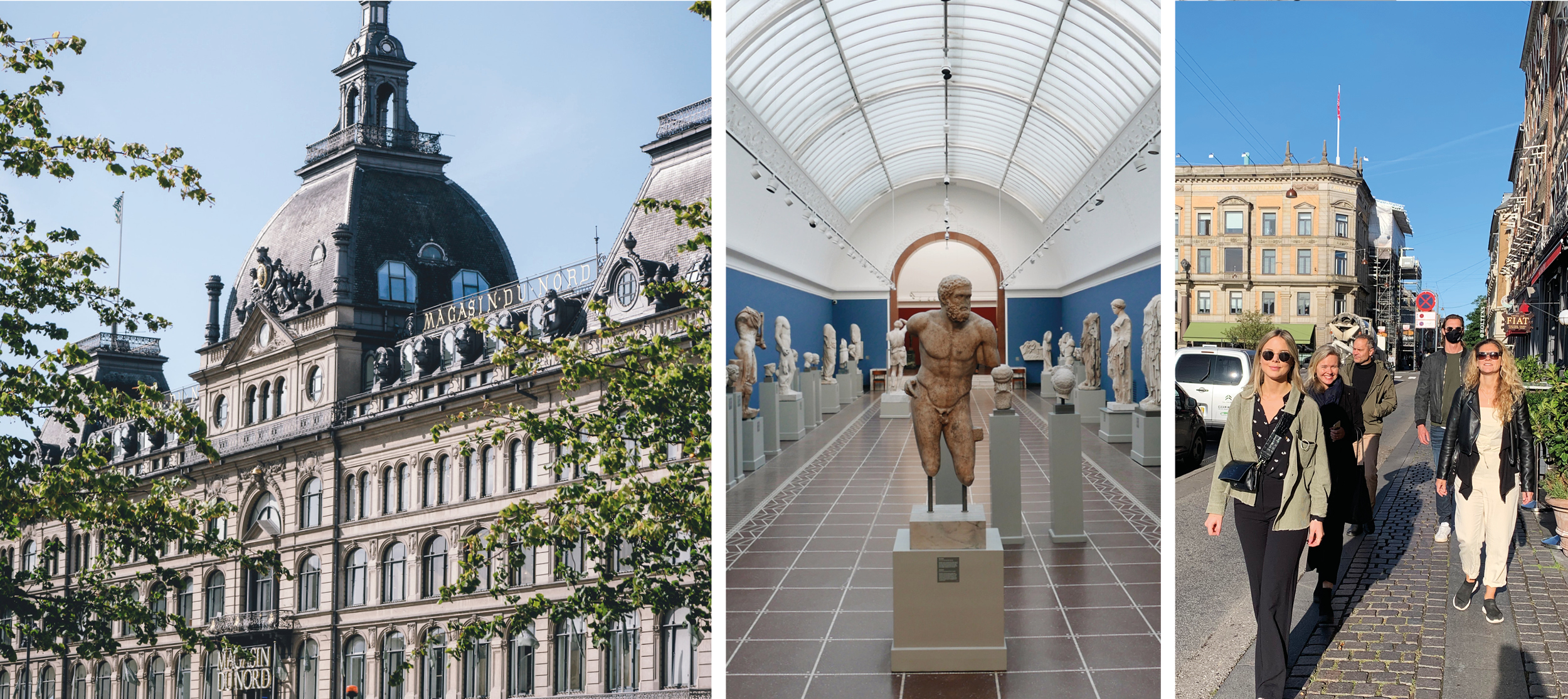
Glypoteket

Copenhagen is a great city for art lovers and home to internationally acknowledged art museums, as well as boosting some fantastic themed and historic museums. We went to visit Glypoteket and their newest exhibition Animals and People featuring internationally acclaimed contemporary artist Tal R. Glypoteket was founded by the Carlsberg brewer Carl Jacobsen and contains two main departments of art – the department of antiquities and the modern department. It was a delightful stroll through 35 000 years of art and history in a beautiful architectural surrounding.

Lunch o’clock

A cosy stroll through the best parts of Copenhagen took us to a gastronomic experience at Gasoline Grill in the sunny weather. Gasoline Grill is originally an old gas station that was transformed into a real American burger joint. It is said to have one of the best burgers in the city and it definitely lived up to its reputation. They have mastered a fantastic burger. Grab one for the go or sit down, either way, we promise you won’t regret it.

Inspiring retail concepts

Next on our tour we headed to two interior design shops, HAY House and Beau Marché. HAY’s concept store houses two floors filled with colours, shapes and design at Strøget. They create contemporary furniture and design with an eye for modern living. From danish design to a nugget of nugget of Frenchnes, Beau Marché. In the back yard between Kongens Nytorv, Strøget, and Gothersgade, which is full of old houses, lovely little cafés and restaurants, the hidden gem Beau Marché is located. A combined French café and a stylish interior design shop. Two shops that truly inspire with their different retail approaches.

Kunsthal Charlottenborg

From contemporary design to contemporary art! Next up was Kunsthal Charlottenborg, one of the largest exhibition spaces for contemporary art in Europe located by Nyhavn. Here you’ll experience exhibitions and events with a strong international focus. We went to se Afgang, the annual exhibition for the graduates from the Royal Danish Academy of Fine Arts’ Schools of Visual Arts.

Afternoon adventures

Our final destination was Apollo bar and the beautiful surroundings of Nyhavn. There we enjoyed the last rays of sun before heading back to Malmö, filled with creativity and feeling truly refreshed.